Saturday, March 6, 2021

March Sketchbox - Holy Markers Batman!!!!

I was so excited for this Sketchbox to get here, and my heart just about burst when I opened it!  

Late last year, we got a box that had a combination of water-based and alcohol-based markers and I had commented at that time on how much better it would have been if it was all alcohol markers.  

WELL IT'S HERE!  

This box is full of alcohol markers and MAN was I excited!  But of course, not all alcohol markers are created equal, and so I tabled my excitement and got to swatching!  Here's my swatches and my thoughts on each product.  

Contents, Prices, and Swatches: 

1. Marabu Marker Set (Sketchbox Exclusive) - $17.50

This set came with a blender, pink, purple, and red alcohol markers with chisel and bullet nibs.  I honestly loved these markers.  They are pigmented, blendable, and a fabulous standard alcohol marker! They performed fabulous on their own and with the other markers as well,  These colors were a fabulous foundation for the rest of what was to come.  It also came with two "permanent" markers in brown and green with bullet and fineliner nibs. These permanent markers are alcohol-based and worked beautifully as fineliners and as regular alcohol markers as well.  Other than the barrel/nibs, I saw no difference between these and the other alcohol markers.  

2.  Copic Sketch, V12 Pale Lilac - $7.99

What can I say, it's a Copic Sketch.  It's the king of all alcohol markers.  It worked like a dream, and the other markers worked wonderfully with it!   Copic Sketch has a brush and chisel nib, which is my preferred nib combo for an alcohol marker BUT I'm not too picky - I've worked with all types!  

3. Copic Classic, V15 Mallow - $7.99

This was a lovely medium purple which allowed for a LOVELY purple gradient!  Purples are generally VERY hard to blend with alcohol markers, but these three purples (Copic Classic, Copic Sketch, and the Marabu Purple) actually achieved a great blend on the paper!  This marker has a bullet and chisel nib and will get lots of use in my collection because of it's color! 

4. AD Spectra Marker, 047 Walnut and 012 Wine - $6.55 each

These were also a fabulous addition to the box!! The wine color was a beautiful dark red that worked wonderfully with the Marabu red marker!  The walnut made a nice blend with the brown Marabu marker too!  These markers have a brush and pointed chisel nib.  I LOVE the pointed chisel nib, it gets fine details AND can cover large areas - it's a really unique tip!  I have had Spectra markers before and I am always impressed by their quality. 

5.  AD Marker Paper, 4x6in Pad, 24 Sheets - $8.49

So at first glance I LOVED this paper.  The swatches worked so well on there, the blender marker did it's job with everything and the gradients were lovely.  It also bled through but not to the next page, so it can clearly take a lot of marker before ruining further pages would be a problem.  When I started blending on the paper, the paper was not my favorite type of marker paper.  I worked with it for awhile, and the pigment sat on top of the paper and blended so easily that it mixed up on the tips of my markers and blender.  I have used marker paper like this before, and it is not my preference BUT I know loads of people that love it.  I think I need to learn how to use it, and so after doing two practice pieces on it I decided not to use it for my large art piece for this box.  HOWEVER, I do think this paper is worth the money if you like this type of paper!  

My first practice piece was of some floral doodles that I used to check out the gradients.  I do like how this piece turned out, but the lightest colors got totally erased by the way I tried to blend on the paper.  I still like where I ended up with this one, but I knew for my second idea I wanted to get smooth blends, so I used my marker sketchbook.  

It's no secret at this point that I love the Legend of Zelda.  When I saw these colors, I KNEW I wanted to draw Vaati.  Vaati is the villian of the Minish Cap.  If you are a Zelda fan and you haven't played the Minish Cap, I *HIGHLY* recommend it!  It's such a great game, and is $8 on the Wii or WiiU shop if you own one of those consoles.  Vaati does have some gold on him, but I just swapped out the brown for the gold.  I also used the lightest purple and the blender to make the skin as "purple gray" as possible, and I think it worked out quite well!  Full disclosure, I did use a black fineliner and a while gel pen to do line work and add details to this piece, but he was so beautiful that I couldn't resist adding those details!  Overall, this is my second Vaati piece in the last year, and I love drawing him.  I love his cape too!  


In addition, my lovely 7 year old daughter always does the Sketchbox with me!  She LOVES them and is often even better with random supplies than me. I love her creative spirit so much!  When she swatched this box, she immediately knew what she wanted to draw - the Truffula Trees from the Lorax!  I love how her picture turned out: 
 

So overall, was this box worth it?  ABSOLUTELY!  The color palette was absolutely beautiful, and worked together SO well to make artwork.  The alcohol markers are all good quality and will be added to my collection proudly! The nibs on the Spectra markers make me want to look out for them on sales to see if I can grab some more because they were so useful and unique!  And, even though I didn't love that marker paper I now KNOW how it works/behaves and so I can practice on it and decide if I'd like to buy more of i.!  This box was SO much fun to play with! 

Did you get this month's Sketchbox?  What did you think of it?  Are you a fan of alcohol markers?  What would you make with this box?  Let me know in the comments below!

Tuesday, March 2, 2021

Bullet Journal Journey - March 2021

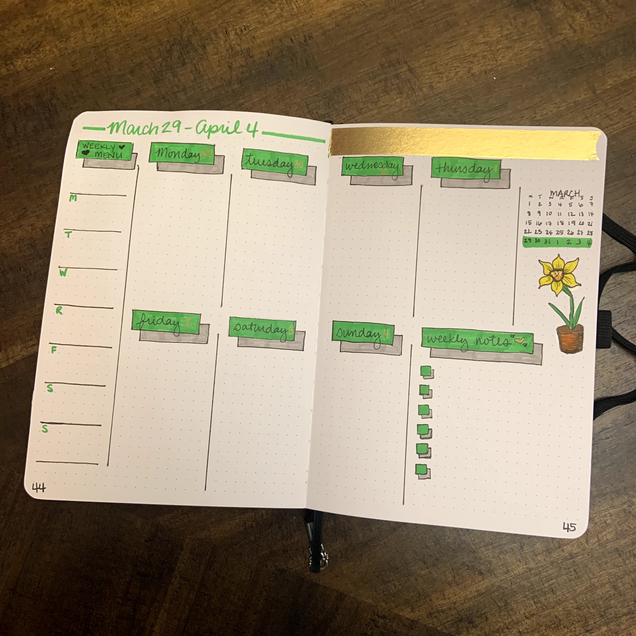
It's the beginning of March, so that means we are going to do another bullet journal flip-through!  This month, I knew I wanted to go with something with a green/plant based theme.  I definitely wanted to include shamrocks and yellow/gold, without doing an all out St. Patrick's Day theme.  Since daffodils are the flower of March, I wanted to add some of them to the spread as well.

I did watercolor a strip for the calendar page, but I ended up liking it so much that I didn't want to cut it up. So, I used washi tapes instead this month!  The result is simple, but I like how it looks!  The mood tracker is a four-leaf clover, because it just felt like a fun one to do.  I can't wait to see how it turns out once it's colored in at the end of March!  The bill tracker is the same from month to month, only changing colors to match the theme.  


This month includes 5 weeks instead of 4, so you will get a little bit of April during this month.  Each week's theme was fun to do!  

Week 1: Leaves


Week 2: Daffodils 


Week 3: St. Patrick's Day

Week 4: Stripes

Week 5: Simple Shadows and another Daffodil 

I had a lot of fun coming up with this layout, and I really enjoy the creative energy I get from using a planner that I have built myself!  

Have you started your bullet journal journey?  How does it inspire your creativity?  What other things do you do to keep your creative juices flowing?  Let me know in the comments below!  

Saturday, February 27, 2021

Sympathy Cards using Background Stencils

 Happy Saturday everyone!  This week, we got some sad news about a family friend that had passed away.  Because of this sad news, my daughter and I sat down and made some sympathy cards to send to their closest loved ones.  In my own style, I usually make sympathy cards that are less busy than my normal designs and often will try to make sure they are decently flat so they can be mailed.  

Lately, I have really been enjoying using my stencils to make backgrounds.  Last year, I bought a nice set of background stencils on Amazon for about $13.  It was around 25 stencils, so this was a total steal.  They are a bit smaller than the standard card size, so you usually have to work hard to get a seamless transition OR just work around it.  On this card, I used a strip of cardstock to hide the transition.  Even though these are a little smaller than what the stamp companies sell, the price for these was well worth it!!!  I use them all the time!  

I used several distress inks (Mermaid Lagoon, Lucky Clover, Cracked Pistachio, and Salty Ocean) to make the background.  After it was inked, I went over it with a lighter layer to make the background match.  I also inked a piece of cardstock for the inside to match.  

Years ago, I bought some ivory pearl cardstock from Paper Source for some wedding invitations.  I still have a whole pack of it that I recently remembered I had, and so I thought it would be the perfect base for this card.  


All of these sentiment stamps come from the Simon Says Stamp Sympathy Greetings Mix that I picked up last September.  It was one of the last stamp sets I have purchased, but I didn't have a good sympathy stamp set, so I know it will be used for many many years.  It also have some nice thinking of you and love sentiments, so it's a really versatile set.  

My lovely 7-yo daughter also wanted to make a card - and so she inked these sweet roses and stamped this beautiful sentiment on top.  I was really proud of how nice her card turned out, so I asked if I could share it here.  :-)  


Do any of you have go-to layouts for certain types of cards?  What are your favorite card making techniques right now?  Let me know in the comments below! 

Tuesday, February 23, 2021

Product Review: Faber Castell Albrecht Durer Magnus Watercolor Pencils

 Last April I got a Scrawlrbox with some Faber Castell Albrecht Durer products, both watercolor brush pens and some of these Magnus pencils.  I remember swatching the pencils and LOVING them.  

Before this time, the only watercolor pencils I owned was a very inexpensive student grade set from Arteza.  I'm NOT knocking those pencils and I still use them all the time!  But I knew I wanted something that I could use more regularly and that had lightfastness ratings.  I also wanted to invest in something that I could replace open stock, so I started watching TONS of reviews and trying to decide what I wanted to do.  Here's what I learned:  

1. I think the Derwent Inktense products would be amazing to own, but they are not traditional watercolors.  Because of this I decided against this investment for the time being.... BUT Derwent just came out with a beautiful 24 half pan of Inktense pans... so that might be in the future!  

2. There are several brands that I think are worth the money, but only one of them was something I had tested (FC Albrecht Durer).  Because of this, I was much more interested in buying these pencils if I could get them.  

3. These pencils look massive, but they actually work really well for my hands.  I have had issues with carpal tunnel for years, and so the bigger pencils work really well for me.  This pencil size was my ultimate reason for deciding to buy these over other brands.  

4. The Magnus pencils are the same as the regular Albrecht Durer line, just larger.  This means that if the Magnus line, which is only 30 colors right now, is missing a color, I can always just buy a regular size AD pencil open stock to supplement the set.  

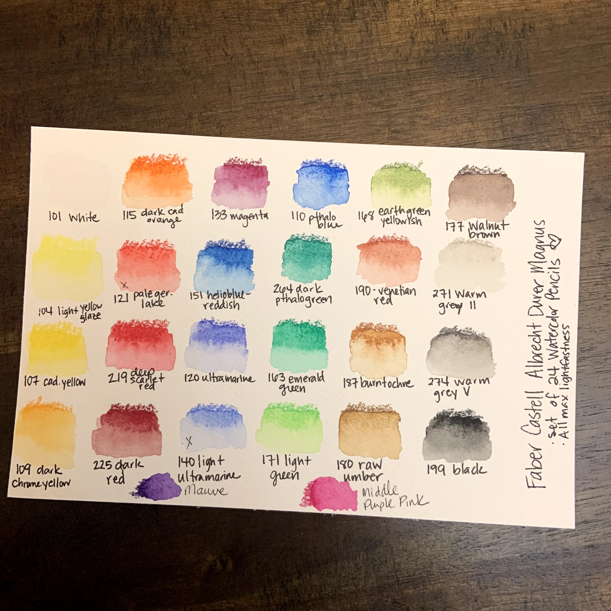
So, these were all of the things that I took into consideration before purchasing this set.  I looked at Caran D'Ache Supracolor, Faber Castell AD, Derwent Inktense, and Prismacolor Premier as my potential purchases. Once I decided on the AD Magnus pencils, I got a fabulous deal on this set of 24 pencils:  

Swatching and Initial Thoughts: 

1. The colors are beautiful and intense!  

2. The pencils are smooth and easy to use!  They are large but definitely can still get fine details if they are sharpened. 

3. The color range was, mostly good.  I was initially frustrated because there wasn't a good cool red/pink option, or a color akin to a dioxazine purple.  Both of those are kind of important if I'm going to use them for florals, so my goal was to find ways to mix those colors.  I was able to get close, BUT I went searching the open stock AD Magnus pencils and found out that they had two pencils that matched those needs exactly!  I bought the open stock colors and replaced them with a warm red and "ultramarine light," which honestly just seems like ultramarine with filler added.  NOW I feel like my set is well balanced and will allow me to do anything I want for my personal style of artwork.  

Artwork and Testing: 

I have been using these for about 2 months now, and so I've tried these pencils on several different types of situations in order to give a full and robust review.  Here are several of the artworks that I used these pencils on and my thoughts. 


  • They work really well in a mixed media setting.  Once set with water, they don't lift when posca pens, fine liners or bleed proof white/white gouache were used overtop of them.  The resistance to the white mediums was particularly fabulous!  
  • The pencils dissolved completely with water BUT they also kept texture and didn't let colors run together.  This especially made my monstera leaf picture really beautiful.  
  • The pencils can both cover a large area and be used for fine details.  
  • The pencils had the ability to blend and mix an entire background beautifully.  I was extremely impressed with their ultra pigmentation in that situation.  
  • Using my Caran D'Ache pencil palette, they mix into extra colors beautifully.  I cannot stress enough how great the palette is, and that it is easily the best $12 I have ever spent on a mixing palette.  (I got mine on Amazon)
Final Thoughts: 

These pencils are absolutely fabulous.  I'm really glad that I took the leap and invested in them!  There's a reason that Faber Castell is a tried and true brand and the larger pencils are a perfect fit for my needs!  I love that I can buy them open stock, and I hope they expand this line so that I can buy more Albrecht Durer pencils in this size!  

Have you ever tried these pencils?  What did you think of them?  Let me know in the comments below!  

Saturday, February 20, 2021

Paletteful Packs February - Micron and Brush Pens

 I know I said no more subscription boxes (maybe I only said it to myself... but I did say it!), BUT after I watched other people online opening the last two Paletteful boxes, I KNEW I had to give it a try!  I mean, first they got Golden acrylics and THEN they got Daniel Smith watercolors?!?!?  The value in these boxes was INSANE, so I had to try it.  

Well.  I have to say that this box was.... underwhelming at best.  Let me be clear, the items in the box are good items, but the value was just not there for me.  Let me go through each item and explain in further detail.  

Here's the items and the swatch card, and then explanations of each item and my feelings.  

Swatches

Back of Swatch Page


Tombow Dual Brush Markers - 3 Green Shades

I love Tombow brush markers.  These were the best part of the box for me.  We got three different green shades and while that was nice, 2 of them were greens I already have and I only own like 15 Tombow brush markers.  That isn't Paletteful's fault but it would have been nice to get something I didn't already have.  I also would have enjoyed at least 2 more Tombow brush pens, maybe a neutral brown or gray and a complementary color like Pink or Orange.  

Denik Sketchbook

This sketchbook was, just ok.  The artwork is beautiful, and I do really like that it was customized by Alice, whose artwork is always fantastic.  The paper wasn't great.  It was thin, and did not hold up very well to the brush markers.  Brush markers are water-based, and so when I tested them with water the paper didn't hold up at all.  There was pilling and warping and bleeding through.  This isn't that big of a deal, but I would have preferred them to use Mixed Media paper that held up to the wet brush pens a bit better. I know this is pricier, but they *could* have done that if they hadn't blown all their money on the final item in the box.  I also feel that at $11.99 this book is overpriced.  I have an Artists Loft sketchbook that is hardbound that I paid $7 for with paper that held up better than this sketchbook.  

Sakura Micron Pens - Exclusive 100th Anniversary Set of 10

Before I go on my rant here, I want to start by saying that I LOVE Micron Pens.  I love them and own a ton of them.  THAT BEING SAID.... 

1. A 10 pack of the same black fineliners, simply in different sizes, is too many.  At most, 5 of the varied nibs will allow you to make a beautiful and richly lined pen piece in my opinion.  

2. These were an *exclusive* item, and the MSRP given was $35.99.  Now, they are pretty.  But they are the same EXACT fineliners that I can get in a normal barrel on Amazon for $17.  For something that performs the exact same way as something half the price, this mark-up of "expected value" is ridiculous.  I do NOT pay for an art subscription to get a fancy looking version of something much cheaper that does the EXACT same thing.  

3. The high MSRP on these *exclusive* pens prevented the box from having other colors of Tombow brush pens, or a pencil (more on that later), or any kind of highlight/white medium.  

4. The petite box, which is cheaper, recieved a BLACKWING PENCIL.  This actually made me upset.  I paid for the bigger box and my assumption was that I would get all that the smaller box had to offer and more.  The petite box got a smaller sketchbook, the same three Tombow pens, only 5 Microns, and a blackwing pencil.  I would have paid $35 for those supplies and honestly felt way better about it than what I did get.  

The bottom line, will I use these pens?  Of course, but I'm pretty ticked that this is the bulk of what I paid for this month.  Getting an art supply that I don't normally use or that is different is totally fine and never disappointing, but paying money because someone slapped an "exclusive anniversary" label on a set of pens is very frustrating.  Especially for something as common as fineliners, which most people that buy art boxes get ALL the time.  This was a huge let down for me.  

Ok onto the art: When I saw the cover of the notebook, I knew I was probably going to draw succulents.  You guys know I'm a sucker for succulents.... hahahaha.  The paper did ok on this drawing but I definitely had to watch for pilling.  I also only used 5 micron pens to prove the point that 5 is the most you would need.  


I still ended up making a nice piece of art with the products in the box. As I said before, I will definitely use all of these art supplies, but if I had bought them on my own I would have paid closer to $32, and this box actually cost me more than that.  I know a lot of people did really like this box, but for me the point of an art subscription box is to get new, fun things to try in new ways.  These were very basic items that were given a huge markup for being exclusives, which is not at all what I'm about.  

All of that being said, I'm going to stick with Paletteful Packs for another month.  I know they normally jam pack their boxes full of fun and value, so I'm going to give them another chance.  

Did you get this box? If so, what were your thoughts?  What are your thoughts on exclusive items?  

Tuesday, February 16, 2021

The Sketchbook Project Flipthrough - Level Up!

 Wow guys - I can't believe I did it!  


When I signed up for The Sketchbook Project, I was excited and nervous.  I loved the concept, and I wanted to be a part of it, BUT putting myself out there in that way felt terrifying.  If you've never heard about the project, you can read more about it here.  The Sketchbook Project was created by the Brooklyn Art Library. Taken from their website, here's a little info about them:  

Brooklyn Art Library is a 501c3 nonprofit organization that has been completely funded by participation since 2006. We work to ensure that we are fulfilling our mission of encouraging creative storytelling within a global community by keeping our physical library space free and open to the public, our digital library accessible worldwide, and making our collection as accessible as possible to people of all ages and skill levels through robust education programming.

I love the inclusive nature of their mission statement, and I know I had to be a part of it!  When I got my Sketchbook, it was in October of 2020, and I was deep into Linktober.  Linktober was huge for me this year, and it really has given me a lot more confident in my skills, even as a hobbyist.  But Linktober gave the shape to the sketchbook, because I knew I wanted to draw video game characters.  


I named the project "Level Up."  The idea was that through the drawing of specific characters and ideas I would be leveling up my own art, so I leaned into the video game pun.  I had a lot of fun drawing each individual piece, and I tried to challenge myself in different ways.  I used alcohol markers, watercolors, gouache and posca pens, metallic watercolors, graphite and water soluble graphite during the course of this book.  I also tried many different types of characters and even a few landscapes and full screen scenes.  


I've highlighted a few of my favorite pieces here, but click below for a full, explained flip through!  I also will have a faster flipthrough on my instagram highlights/story as well.  


Once the sketchbook is digitized, I'll have a link here and as a tab on my page!  

What are your thoughts on The Sketchbook Project?  Would you ever fill one out?  What would your sketchbook be about? Let me know in the comments below!  

Saturday, February 13, 2021

Patterned Paper Valentines

 Happy Valentine's Day!  

Today I'm sharing some Valentines that I made that are GREAT because: 

  1. They use up patterned paper that you might have a hard time using in other ways
  2. They are easy and can be done in stages while watching lots of TV
  3. They can be done with any patterned paper, sentiments, etc... so they aren't specific to V-Day
  4. They are flat and VERY mail-able! 
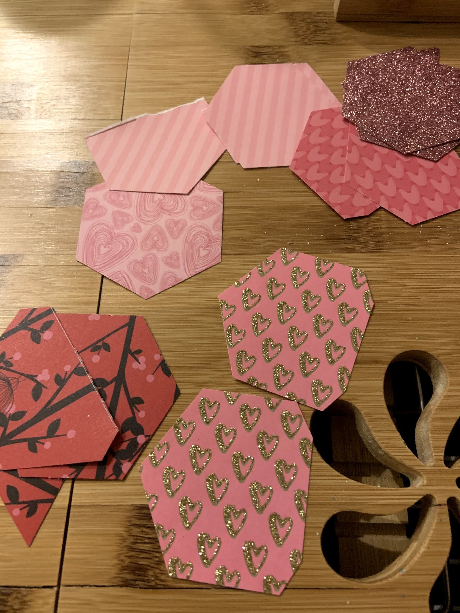
I have a hexagonal paper punch that I really love and don't use enough.  For these cards, I took this punch and several V-Day patterned papers that I know I wouldn't use for a background and I punched out a TON of hexagons and partial hexagons.  I had VERY little paper leftover from this process, and I used almost all of them to make a total of 6 cards!  I also punched white/blank hexagons to glue on for sentiments.  

Note: you could do this with lots of punches, even circles!  You could also do it with a shape die cut OR simple paper strips too!  There's really no wrong way to do it!  The idea is to use up some patterned paper to create a new, interesting card front!  


Then, I glued the hexagons onto a 4.25 by 5.5 piece of pink cardstock.  I left a little border around the hexagons but you could also completely cover up the background if you wanted to!  If you are going to leave a border, try to pick a color that matches your pieces.  This process was pretty easy and mindless, and I did it while I was watching TV. 


The next day, I stamped a sentiment on each card.  I used a simple "With Love" sentiment because I liked the simple stamp against the busy background.  Then, I glued the card fronts to plain, white cards!  


And that's it!  This project was super great because it used up a bunch of my papers in a creative way, AND it creates a beautiful background that is also flat and easy to mail!  I'm looking forward to revisiting this idea in the future for some fun and fast birthday cards!  

Have you ever done something similar to this with patterned paper? What shape of punch or die cut would you use?  Let me know in the comments below!