Showing posts with label zelda. Show all posts

Saturday, March 6, 2021

March Sketchbox - Holy Markers Batman!!!!

I was so excited for this Sketchbox to get here, and my heart just about burst when I opened it!  

Late last year, we got a box that had a combination of water-based and alcohol-based markers and I had commented at that time on how much better it would have been if it was all alcohol markers.  

WELL IT'S HERE!  

This box is full of alcohol markers and MAN was I excited!  But of course, not all alcohol markers are created equal, and so I tabled my excitement and got to swatching!  Here's my swatches and my thoughts on each product.  

Contents, Prices, and Swatches: 

1. Marabu Marker Set (Sketchbox Exclusive) - $17.50

This set came with a blender, pink, purple, and red alcohol markers with chisel and bullet nibs.  I honestly loved these markers.  They are pigmented, blendable, and a fabulous standard alcohol marker! They performed fabulous on their own and with the other markers as well,  These colors were a fabulous foundation for the rest of what was to come.  It also came with two "permanent" markers in brown and green with bullet and fineliner nibs. These permanent markers are alcohol-based and worked beautifully as fineliners and as regular alcohol markers as well.  Other than the barrel/nibs, I saw no difference between these and the other alcohol markers.  

2.  Copic Sketch, V12 Pale Lilac - $7.99

What can I say, it's a Copic Sketch.  It's the king of all alcohol markers.  It worked like a dream, and the other markers worked wonderfully with it!   Copic Sketch has a brush and chisel nib, which is my preferred nib combo for an alcohol marker BUT I'm not too picky - I've worked with all types!  

3. Copic Classic, V15 Mallow - $7.99

This was a lovely medium purple which allowed for a LOVELY purple gradient!  Purples are generally VERY hard to blend with alcohol markers, but these three purples (Copic Classic, Copic Sketch, and the Marabu Purple) actually achieved a great blend on the paper!  This marker has a bullet and chisel nib and will get lots of use in my collection because of it's color! 

4. AD Spectra Marker, 047 Walnut and 012 Wine - $6.55 each

These were also a fabulous addition to the box!! The wine color was a beautiful dark red that worked wonderfully with the Marabu red marker!  The walnut made a nice blend with the brown Marabu marker too!  These markers have a brush and pointed chisel nib.  I LOVE the pointed chisel nib, it gets fine details AND can cover large areas - it's a really unique tip!  I have had Spectra markers before and I am always impressed by their quality. 

5.  AD Marker Paper, 4x6in Pad, 24 Sheets - $8.49

So at first glance I LOVED this paper.  The swatches worked so well on there, the blender marker did it's job with everything and the gradients were lovely.  It also bled through but not to the next page, so it can clearly take a lot of marker before ruining further pages would be a problem.  When I started blending on the paper, the paper was not my favorite type of marker paper.  I worked with it for awhile, and the pigment sat on top of the paper and blended so easily that it mixed up on the tips of my markers and blender.  I have used marker paper like this before, and it is not my preference BUT I know loads of people that love it.  I think I need to learn how to use it, and so after doing two practice pieces on it I decided not to use it for my large art piece for this box.  HOWEVER, I do think this paper is worth the money if you like this type of paper!  

My first practice piece was of some floral doodles that I used to check out the gradients.  I do like how this piece turned out, but the lightest colors got totally erased by the way I tried to blend on the paper.  I still like where I ended up with this one, but I knew for my second idea I wanted to get smooth blends, so I used my marker sketchbook.  

It's no secret at this point that I love the Legend of Zelda.  When I saw these colors, I KNEW I wanted to draw Vaati.  Vaati is the villian of the Minish Cap.  If you are a Zelda fan and you haven't played the Minish Cap, I *HIGHLY* recommend it!  It's such a great game, and is $8 on the Wii or WiiU shop if you own one of those consoles.  Vaati does have some gold on him, but I just swapped out the brown for the gold.  I also used the lightest purple and the blender to make the skin as "purple gray" as possible, and I think it worked out quite well!  Full disclosure, I did use a black fineliner and a while gel pen to do line work and add details to this piece, but he was so beautiful that I couldn't resist adding those details!  Overall, this is my second Vaati piece in the last year, and I love drawing him.  I love his cape too!  


In addition, my lovely 7 year old daughter always does the Sketchbox with me!  She LOVES them and is often even better with random supplies than me. I love her creative spirit so much!  When she swatched this box, she immediately knew what she wanted to draw - the Truffula Trees from the Lorax!  I love how her picture turned out: 
 

So overall, was this box worth it?  ABSOLUTELY!  The color palette was absolutely beautiful, and worked together SO well to make artwork.  The alcohol markers are all good quality and will be added to my collection proudly! The nibs on the Spectra markers make me want to look out for them on sales to see if I can grab some more because they were so useful and unique!  And, even though I didn't love that marker paper I now KNOW how it works/behaves and so I can practice on it and decide if I'd like to buy more of i.!  This box was SO much fun to play with! 

Did you get this month's Sketchbox?  What did you think of it?  Are you a fan of alcohol markers?  What would you make with this box?  Let me know in the comments below!

Tuesday, February 16, 2021

The Sketchbook Project Flipthrough - Level Up!

 Wow guys - I can't believe I did it!  


When I signed up for The Sketchbook Project, I was excited and nervous.  I loved the concept, and I wanted to be a part of it, BUT putting myself out there in that way felt terrifying.  If you've never heard about the project, you can read more about it here.  The Sketchbook Project was created by the Brooklyn Art Library. Taken from their website, here's a little info about them:  

Brooklyn Art Library is a 501c3 nonprofit organization that has been completely funded by participation since 2006. We work to ensure that we are fulfilling our mission of encouraging creative storytelling within a global community by keeping our physical library space free and open to the public, our digital library accessible worldwide, and making our collection as accessible as possible to people of all ages and skill levels through robust education programming.

I love the inclusive nature of their mission statement, and I know I had to be a part of it!  When I got my Sketchbook, it was in October of 2020, and I was deep into Linktober.  Linktober was huge for me this year, and it really has given me a lot more confident in my skills, even as a hobbyist.  But Linktober gave the shape to the sketchbook, because I knew I wanted to draw video game characters.  


I named the project "Level Up."  The idea was that through the drawing of specific characters and ideas I would be leveling up my own art, so I leaned into the video game pun.  I had a lot of fun drawing each individual piece, and I tried to challenge myself in different ways.  I used alcohol markers, watercolors, gouache and posca pens, metallic watercolors, graphite and water soluble graphite during the course of this book.  I also tried many different types of characters and even a few landscapes and full screen scenes.  


I've highlighted a few of my favorite pieces here, but click below for a full, explained flip through!  I also will have a faster flipthrough on my instagram highlights/story as well.  


Once the sketchbook is digitized, I'll have a link here and as a tab on my page!  

What are your thoughts on The Sketchbook Project?  Would you ever fill one out?  What would your sketchbook be about? Let me know in the comments below!  

Tuesday, February 9, 2021

February Sketchbox - Water Soluble GRAPHITE!!!!!

 Another month, another Sketchbox!!! I must admit, I've been playing around with this box of supplies for over a week now and I'm just HAVING SO MUCH FUN!  More on this later!  

Let's start with swatches, what's in the box, and my thoughts on each item in the box:  

Supplies: 

  • Princeton Heritage Brush - Round #6 
    • This is a beautiful paintbrush.  I enjoyed using it very much!  Valued at $14, I would have settled for something a little less expensive if it meant getting an eraser in this box. 
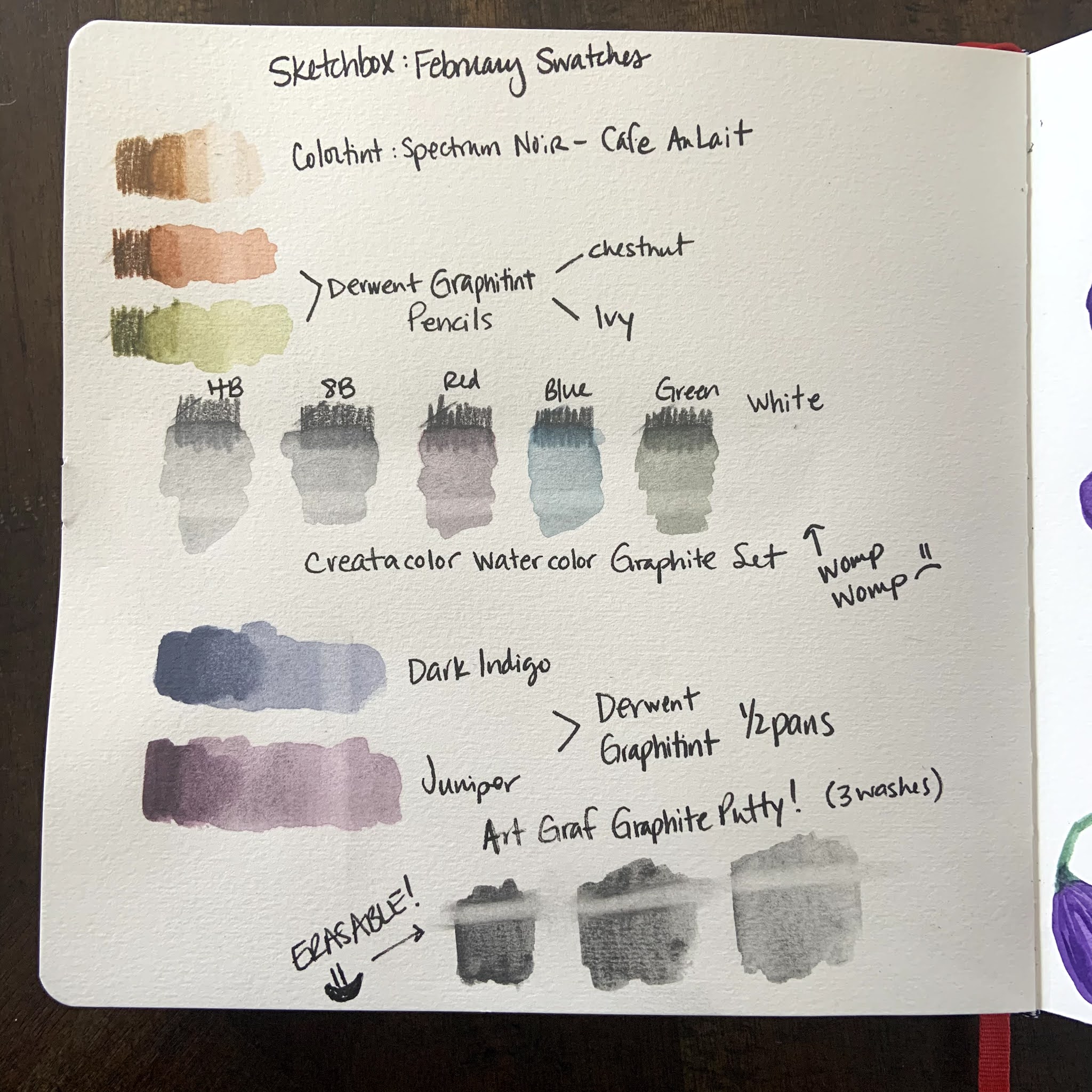
  • Derwent Graphitint Half Pans - Dark Indigo and Juniper
    • These. Are. Amazing!  I have seen people use these online before, but I was NOT prepared for how awesome they are!  I really want the whole set now!  The colors were beautiful and granulated so nicely.  They of course are the quality I expect from Derwent.  These erased a bit, but not completely. 

  • Derwent Graphitint Pencils - Ivy and Chestnut
    • These were also pretty darn awesome!  I loved the colors and they dissolved quite nicely when using water on them.  These erased a bit, but not completely.  

  • Spectrum Noir Colortint Pencil - Cafe Au Lait
    • This was a nice pencil as well!  I didn't love it as much as the Graphitint pencils, but it was still a nice, dissolving pencil and it was great to have two different browns to create nice contrast.  This pencil *did* have a more clean erase than any of the Graphitint products, which was great.  

  • ArtGraph Drawing Graphite Putty
    • I was terrified of this package when I saw it.  I waited DAYS to open it.  When I opened it, I used a tiny scoop to take a VERY small amount out into my palette.  As soon as I put the paintbrush to it I was IN LOVE!  This stuff is literally liquid graphite.  I loved being able to use graphite like paint.  But THEN the best part - YOU CAN ERASE IT!  That's right!  It takes a little more to erase than dry pencil, which is perfect because you can draw on top of it and do a light erase without messing up the under layer, but you can also erase it to create highlights!!!!!  WHAT!?!?!  This is the star of the box, and I'm so excited to use it in the future too! One small thing I'd wished was that the plastic bag had a zip top instead of a tear open top so that I could easily keep it sealed.  But this stuff was AMAZING!  

  • Cretacolor Watercolor Graphite Set, 6 pc
    • Finally, these were decent!  I LOVED the two graphite pencils, the blue and the green.  They were high quality.  These pencils dissolved decently well and they erased pretty well too.  BUT, the red was weak, and was almost the same color as the juniper Graphitint so it didn't really get used much in my piece.  And the white, the white was absolutely useless.  It didn't layer over anything, it didn't write over any of the other graphite, and I didn't use it at all.  I even tried to scribble a bunch of it out and pick it up with a paintbrush to go on the top of the other graphite, and it did... nothing.  I'd much have preferred a 4 piece set here and a swap out for those two pencils for an opaque white medium.  

Quick Notes: 

  • We didn't get paper this month.  I'm totally fine with that because the value of the rest of the box was great!  Also - Sketchbox has sent plenty of wet media paper in recent boxes, so everyone should have something to put their art on/in.  
  • I definitely benefited from having the Caran D'Ache Palette Aquarelle.  (Palette pictured below.) This is a palette with a smooth side and a rough side, designed to scribble out pencils and pick them up with a wet brush.  It is easily the best $11 I've ever spent on a palette.  I'd HIGHLY recommend it if you ever use watercolor pencils!  
  • I used the TINIEST bit of graphite putty!  I have a picture of the palette I used for that so you can see that a little really does go a long way with that stuff!  

Caran D'Ache Palette Aquarelle and my Palette with the Graphite Putty

Box Value: Sketchbox values this box at $52.93 and I have to say it's definitely worth my money!  I will use 90% of what's in this box over and over again for a long time to come.  The *only* thing I would say is that the Creatacolor red and white weren't very useful, and I would have traded them out for a nice eraser and a white opaque medium that actually layers over the graphite.  

That being said...  

This box was AWESOME.  This is exactly what an art subscription should be and should provide.  I would *never* play with graphite on my own accord, but give me graphite the works like watercolor and BAM - I'm pricing out Derwent Graphitint everything online!  And that graphite putty is one of the coolest things I have ever gotten in an art box.  GREAT JOB Sketchbox!  

What did I draw? I knew *immediately* when I saw how the graphite putty worked that I had to draw a statue!  And so of COURSE I drew Hylia from Skyward Sword!  I knew right away that the indigo Graphitint would look amazing as a dark sky.  I also used the pencils and half pans to create a cobblestone path.  I used both green and brown pencils to create the trees, that turned out whimsical just like the trees from Skyward Sword.  I used a combination of wet and dry graphite for Hylia herself.  I'm so very pleased with how this piece turned out!  

Have you ever played with water soluble graphite?  What would you make with this Sketchbox?  Let me know in the comments below! 

Tuesday, November 10, 2020

Welcome!

 Hi everyone - welcome to Artsy Bits by K - the blog!  I just decided that I don't love long Instagram posts, and that sometimes I'd like to say more about my art process than just a tiny blurb.  

I am just someone that is having fun with art supplies.  Please know that I'm not an expert by any means and that my opinions are just that.  I've been having a lot of fun in the past year using art as a creative outlet during this year of quarantine and it's been a blast.  

Here are two of my favorite pieces that I did for Linktober this year - a picture of Levias from Skyward Sword and the Koroks from Windwaker.  I was super happy with how these both turned out and have learned that for character creation I'm really in love with hot press watercolor paper.  


I hope that you enjoy my journey and feel free to leave a happy comment here or there!