Showing posts with label january. Show all posts

Wednesday, January 5, 2022

2022 Bullet Journal Setup and January Theme

Happy 2022 everyone!  It’s a new year, and you know what that means - a new bullet journal!!!  Last year I bought a beautiful journal from Archer and Olive and while I enjoyed it a lot, there were a few things about it that I found myself wishing for it.  


  1. I had 192 pages and that was barely enough.  I found myself trying to find ways to double up a few weeks in order to have enough room.  

  2. I really wished I had a spot at the beginning of the journal to put things like important dates etc… but I hadn’t allotted for that because of the number of pages.  


Still, I really loved a LOT of things about this journal.  My favorite things about it were: 

  1. The pages were super thick, and so I could do just about anything to them (except alcohol markers), and they wouldn’t ghost at all.  This included all of my water based pens, watercolors, fineliners, and gouache.  It was glorious and amazing.  

  2. The size and layout of the dot grid was awesome and I knew I wanted the same again.  I keep my layouts pretty standard from month to month and my weekly layout never changes, so I knew I wanted that same size and grid pattern.  

  3. I liked the built in bookmarks and back pocket and wanted those features again.  


So, I spent a LOT of time considering journals.  I wanted to keep my budget around $30-45, but I also wanted the similar quality and more pages.  I did a lot of looking and researching, and I came across Vivid Scribbles Company.  They had a 200 page journal that claimed an Archer and Olive level of no ghosting, and that also included extra pages like an index in the front and pen test spot in the back.  What’s even better is that this was all for $24.99!!!!  I figured it was too good to be true, but for the price figured I’d definitely buy one to try.  I got this journal a few months back, and this particular color seems to be discontinued but here it is:  


I tested several types of pens on the pen test page, along with 2 different kinds of watercolor.  The book has no ghosting for any of the tests I tried!  I’d even say that each type of pen took 4-5 passes on the pages well before I was concerned at all about tearing.  I rarely would do that many passes, if ever, so I’m super pleased with these tests.  The index and key etc… at the front is a great addition to the book, and this one has 3 ribbons instead of the 2 on the Archer and Olive notebook.  Theirs had a fancy metal weight at the end of each ribbon, and while that is a nice detail it’s not necessary and I don’t miss it!  


I got my journal at the Amazon link listed here, and I also am going to link the Vivid Scribbles main site too!  So far, this has been a wonderful bullet journal option and I’d recommend it to anyone that is looking for a solid, affordable bullet journal!  


This year, along with an index that I’m going to do by month, I also allotted a page for important dates, and have one more blank page to use as needed.  I also always make a page in the front for all of my friends and family birthdays and anniversaries, and a spot to categorize the books I’ve read.  I added a spot for movies and games too this year to that page!  


Finally, my monthly spreads are a little different this year.  I’m making my mood trackers smaller and adding other monthly habits to the same page.  Then, with my extra page I’m dedicating a page each month for planning for YouTube, Instagram, Twitch, and this blog.  So far I’m super happy with how this is turning out!  This month I went with a cool colored striped sweater theme, and my mood tracker is a snowman’s scarf. 


Here’s a video that goes through the whole thing and shows off all of the details! 


Do you keep a bullet journal?  How do you lay yours out?  Let me know in the comments below!


Sunday, January 2, 2022

January 2022 Sketchbox - the ACTUAL last one!

 So I thought my December Sketchbox was my final one, but it turns out that I still had one more coming to me!  This box was all about watercolor powders, and was quite something.  Here's what was in the box and my thoughts on each item below:  


1.  Sketchbox Signature Watercolor Powders in Orange, Navy, Turquoise and Grape

Ooooooo boy.  To start, I really dislike this trend of "Sketchbox Signature" supplies.  Scrawlrbox has pulled this too recently, and I feel like it's a very frustrating way to disguise value in a box.  It's very hard to "compare" a signature brand to price it out, AND if you end up liking a product you still can't replace it when it's done.  I have several TCW ColorSparx Powders and Ken Oliver Color Burst Powders and I love both of those companies.  These powders were not as quality as either of them and the bottles were absolute garbage.  The bottles actually don't sit flat on a desk, and will DEFINITELY fall and be insanely messy.  The grape color was a nasty shade of purple, and the navy and turquoise looked backwards to me.  Overall these were a total fail to me and because they were the main item in the box I'd advise that you buy one of the other companies I mentioned above instead. 

2. Sketchbox Signature Filbert #4 Brush

Again, this was a pretty normal brush, but it being labeled as Sketchbox Signature makes it really hard to price out and possibly buy again if I like the brush.  It was a decent brush but nothing terribly special.  

3.  Copic Multiliner 0.5 in Lavender

This was a nice liner!  I didn't feel it was a terribly good color considering the rest of this box, and so I could have done without it, BUT I will use the liner in other projects.  

4. TCW Color Sparx Exclusive for Sketchbox Powder, Bouganvilla

This was the best thing in the box.  It's a great powder and the color was really nice.  I'm excited to add this color to my other watercolor powders! 

5. Rembrandt Extra Fine Transparent Watercolor - Titanium White

I REALLY wish this had been a tube of white gouache.  It would have given us a LOT more options with this box if it had been a gouache.  It did dilute the very bright powders down to create differences, but I still think a gouache would have achieved the same thing and also have given us some more highlight capabilities.  

5. Sketchbox Signature Magnani 1404 Hot Press Watercolor Paper

This was really nice paper.  I do think that for the value it was given that there is better paper out there.  The Megnani paper always seems to feather on me badly if I use a lot of water on it, and that shouldn't happen with properly sized paper.  If you want solid 100% cotton hot press watercolor paper, grab a paul rubens hot press watercolor sketchbook on amazon.  

I was so irritated with these Sketchbox Signature powders that I didn't even try to make a piece of art with them because I didn't want to make a complete mess of my art space.  My personal opinion is that even though this box technically has a "good value" (but like 2/3 of the box was sketchbox signature stuff I couldn't price so take that for what you will...) I think you'd be better off to just purchase some Ken Oliver Color Burst Powders, a Paul Rubens Hot Press Sketchbook, and a small tube of white gouache and still be at around $40 for MUCH better products.  

Here's the full video if you wanna see the swatching powder fails: 


Did you get this box?  What did you think of these powders?  Let me know in the comments below! 

Tuesday, February 23, 2021

Product Review: Faber Castell Albrecht Durer Magnus Watercolor Pencils

 Last April I got a Scrawlrbox with some Faber Castell Albrecht Durer products, both watercolor brush pens and some of these Magnus pencils.  I remember swatching the pencils and LOVING them.  

Before this time, the only watercolor pencils I owned was a very inexpensive student grade set from Arteza.  I'm NOT knocking those pencils and I still use them all the time!  But I knew I wanted something that I could use more regularly and that had lightfastness ratings.  I also wanted to invest in something that I could replace open stock, so I started watching TONS of reviews and trying to decide what I wanted to do.  Here's what I learned:  

1. I think the Derwent Inktense products would be amazing to own, but they are not traditional watercolors.  Because of this I decided against this investment for the time being.... BUT Derwent just came out with a beautiful 24 half pan of Inktense pans... so that might be in the future!  

2. There are several brands that I think are worth the money, but only one of them was something I had tested (FC Albrecht Durer).  Because of this, I was much more interested in buying these pencils if I could get them.  

3. These pencils look massive, but they actually work really well for my hands.  I have had issues with carpal tunnel for years, and so the bigger pencils work really well for me.  This pencil size was my ultimate reason for deciding to buy these over other brands.  

4. The Magnus pencils are the same as the regular Albrecht Durer line, just larger.  This means that if the Magnus line, which is only 30 colors right now, is missing a color, I can always just buy a regular size AD pencil open stock to supplement the set.  

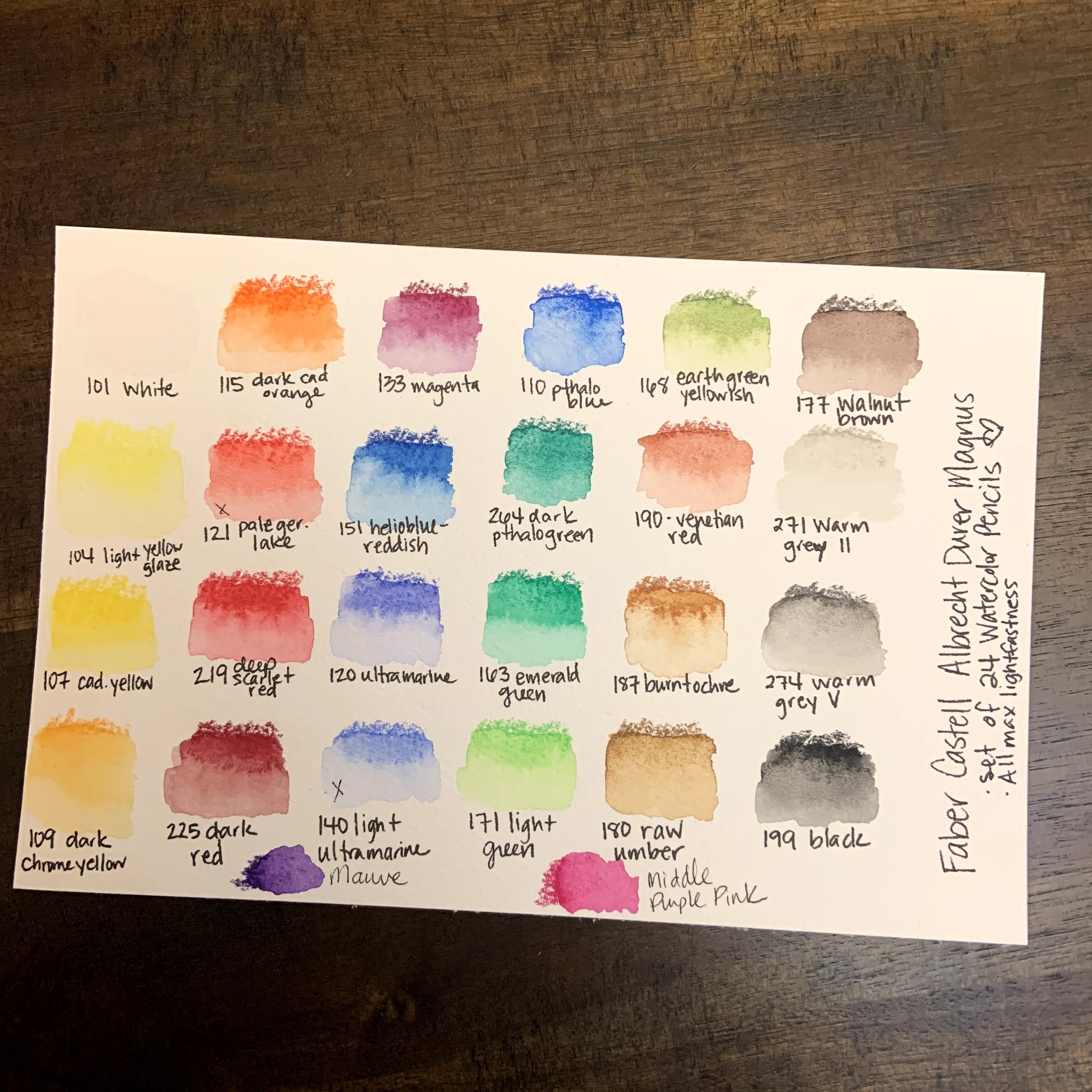
So, these were all of the things that I took into consideration before purchasing this set.  I looked at Caran D'Ache Supracolor, Faber Castell AD, Derwent Inktense, and Prismacolor Premier as my potential purchases. Once I decided on the AD Magnus pencils, I got a fabulous deal on this set of 24 pencils:  

Swatching and Initial Thoughts: 

1. The colors are beautiful and intense!  

2. The pencils are smooth and easy to use!  They are large but definitely can still get fine details if they are sharpened. 

3. The color range was, mostly good.  I was initially frustrated because there wasn't a good cool red/pink option, or a color akin to a dioxazine purple.  Both of those are kind of important if I'm going to use them for florals, so my goal was to find ways to mix those colors.  I was able to get close, BUT I went searching the open stock AD Magnus pencils and found out that they had two pencils that matched those needs exactly!  I bought the open stock colors and replaced them with a warm red and "ultramarine light," which honestly just seems like ultramarine with filler added.  NOW I feel like my set is well balanced and will allow me to do anything I want for my personal style of artwork.  

Artwork and Testing: 

I have been using these for about 2 months now, and so I've tried these pencils on several different types of situations in order to give a full and robust review.  Here are several of the artworks that I used these pencils on and my thoughts. 


  • They work really well in a mixed media setting.  Once set with water, they don't lift when posca pens, fine liners or bleed proof white/white gouache were used overtop of them.  The resistance to the white mediums was particularly fabulous!  
  • The pencils dissolved completely with water BUT they also kept texture and didn't let colors run together.  This especially made my monstera leaf picture really beautiful.  
  • The pencils can both cover a large area and be used for fine details.  
  • The pencils had the ability to blend and mix an entire background beautifully.  I was extremely impressed with their ultra pigmentation in that situation.  
  • Using my Caran D'Ache pencil palette, they mix into extra colors beautifully.  I cannot stress enough how great the palette is, and that it is easily the best $12 I have ever spent on a mixing palette.  (I got mine on Amazon)
Final Thoughts: 

These pencils are absolutely fabulous.  I'm really glad that I took the leap and invested in them!  There's a reason that Faber Castell is a tried and true brand and the larger pencils are a perfect fit for my needs!  I love that I can buy them open stock, and I hope they expand this line so that I can buy more Albrecht Durer pencils in this size!  

Have you ever tried these pencils?  What did you think of them?  Let me know in the comments below!  

Saturday, January 2, 2021

2021 Bullet Journal Journey - January

Happy New Year!!!  I've been so excited to share with you my 2021 bullet journal!!!  I decided after last year to jump into bullet journaling with a blank journal this year after my year with the blank calendar format from 2020.  I did a LOT of research, and decided to go with a book from Archer and Olive.  It has thick pages that hold up to just about any type of brush marker or paint pen, which gives me a LOT of options to decorate the journal.  Here is the one I picked out:  

I've decided that for each month, I'm going to start with the following basic format: 

- Month intro and goals spread

- Monthly calendar spread

- Monthly mood tracker and budget spread

- Weekly spreads with a spot for notes and menu planning

For January, I went with a cool, blue/purple theme.  I also miscalculated my pages and so I ended up combining the calendar and monthly goals spread.  It turned out really nice, but the calendar is definitely smaller than I'd like and I'll fix that in upcoming months:  


I really enjoyed using my mildliners, clean color dot pens, and posca pens to create these pages!  I'm also looking forward to trying out several weekly spreads to see which type works best for me in this journal.  Last January, my mood tracker was a scarf on a snowman, and so I thought this cozy hat would make a cute mood tracker for this year!!!  I can't wait to see it once it's finished!  I also really missed out on adding a watercolor strip to this month.  I could still add one under the January calendar.... we shall see.  But overall I love the thick pages of this journal and how easy it is to format.  

Are any of you taking the bullet journal journey this year?  Let me know how you formal yours in the comments!