Over the holidays, I got a bunch of new art goodies! My birthday is right around Christmas, so it’s usually my time of year to spend gift cards on art goodies and to ask for things I don’t want to buy myself! This year for my birthday, my sister bought me the set of Rosa Gallery Watercolors. I got the classic set that comes in the plastic palette. Generally, I prefer a plastic palette over a metal one, and I had been very intrigued by this set.
This set comes with full pans, says to be artist quality, and has both pigment information and lightfastness ratings. You can find that information HERE. For a pricetag around $35-$40, I HAD to know if they were quality paints!
The first thing I noticed using these was how much I loved the size of the full pans and the amazing mixing space on this palette. The paint has wonderful flow, and certain colors do granulate. I used a salt technique with at least one piece and got even more beautiful granulation, but was also able to get flat, beautiful washes for the most part.
I did notice that it seems like certain colors (violet and indigo in particular) seem to flow a LOT more than the other colors. This might just be me, but they definitely seemed to move more than others. This isn’t a problem or anything, but it is something to note if you are going to use the set.
I also missed a few, specific colors in this set. I think the olive green is more earthy than a traditional “sap green,” and while it’s not a bad color I found myself mixing sap green all the time. I also missed having a pink and a cobalt turquoise in this set, which is completely personal preference. I ended up going on Etsy and purchasing those three full pans (sap green, opera pink, cobalt turquoise) from this store, and they were a great addition to the set. The “modern” version of this set (listed here on Amazon) includes a pink and a cobalt turquoise, but I love the plastic palette so much that I’m glad I ended up with it and extra colors!
The longer I used these paints, the more their strong, vibrant pigments impressed me. The colors are just beautiful and produce gorgeous mixes and color bleeds on the paper. Everytime I sat down to paint something just for fun, I felt myself reaching for this set. This is the reason they are the first product review from my big christmas/birthday haul, because I’ve already used them SO much! So I was finding joy in the paints, and they had listed lightfastness and pigment information, so how do they compare to similar (or lesser) sets?
So - I would categorize these paints as a wonderful “starter artist” set. I would not expect them to perform as well as my Daniel Smith or M Graham sets - though in my humble opinion, they DO hold up to these sets decently well! So I’d like to compare them to the MeiLiang Pretty Excellent watercolor set, distributed by the same parent company as Paul Rubens art supplies, and to the Winsor and Newton Cotman watercolors.
The Pretty Excellent watercolor set comes with 36 half pans, lightfast and pigment information, and usually is around $20 on Amazon. You cannot purchase the colors open stock, and it does come with a nice tin.
Windsor and Newton Cotmans come in all shapes and forms - so I tried to find what I would consider to be the most comparable set. Their “studio” set comes with 24 full pans (similar colors) in a metal tin and costs about $60 at the major retailers (Amazon, Blick, Jerry’s Artarama.) You can purchase these full pans open stock, and there is lightfast and pigment information attached to the paints.
Considering both of the above options, I’d consider the Rosa the clear winner here. The Pretty Excellent paints are of similar quality and cheaper, but they do not offer an open stock replacement option if you like them. You can buy individual full pans of the Rosa paints, and you get a LOT more paint for the $35 (making the price comparable in my opinion!) The Cotmans are available open stock, but their pricetag is much higher and, to be honest, I don’t think they are nearly as vibrant or pigmented as the Rosa paints.
Overall, these paints are for just about everyone! If you are a serious watercolor artist, I think you will be impressed with these but also not find them so precious that you don’t use them. If you are a beginner, this set definitely encourages you to mix colors and offers a great mixing set for landscapes and florals. If you are somewhere in between but want to try something higher quality at a budget, these are your paints! Watch here for the video review:
Do you have these paints? Is there another set out there that they remind you of? Let me know in the comments below!
So this week I’m coming to you with two things that I bought myself for my birthday! These are two items that I really wanted to have/try, and since they were both going to be limited releases I just spent some of my own birthday money on each one! I feel extremely fortunate to have the ability to do this and I’m super glad that I did!
I’m going to walk through the info about each of these two things and then tell you my thoughts and feeling after using each one.
EmJxCraftamo Brush Set
Let me start by saying that if you don’t watch Emma Lefevbre on YouTube you need to stop reading this RIGHT NOW and go subscribe to her. She is absolutely one of my favorite artists online and I’ve learned so much from her! I went into this purchase with a good vibe, because I know that if Emma put her name on these that they are going to be a great product (she does not endorse stuff often or lightly!)
As a watercolor hobbyist, I’ve tried a TON of round brushes. I usually tend to prefer something that is somewhere in between super stiff and super soft. I can work with either thing, but that’s my preference. I was very interested in this set of bamboo brushes because they looked to have amazing points, hold a lot of water, but still to be a little bit softer than your typical synthetic brush. I was intrigued. I also LOVED the size choices of the set - a Round 2, Round, 6, Round 12 and ¾ Mop.
Right away, I noticed that these brushes DO hold a ton of water for their short bristles! This was exciting, but they also provided me with great control. The brushes are well made and felt great in my hands. I’ve been using them for several weeks now and the pointed tips are still as good as new. The mop brush will work for large pages, and holds a ton of water. The box they came in was beautiful, and the extra piece of Emma artwork was a wonderful bonus! All in all, these are a wonderful, versatile set of brushes that I will use for a long time! They are almost sold out, but if you want a set you can snag them here:
Etchr Lab Signature Series Perfect Sketchbook - B5
Etchr is another company that I absolutely trust to put out high quality items. Their mixed media cold pressed sketchbooks are absolutely wonderful and work double sided more beautifully than any other watercolor sketchbook I have tried. When Etchr said they were doing a limited release run of their Perfect Sketchbook I knew I wanted to grab one to use for my more flushed out art pieces.
This sketchbook is 300 gsm cold pressed Fabriano Artistico paper. It has 52 pages and has beautifully deckled edges. It is a portrait sketchbook with a sewn in bookmark and a vegan leather cover. It is absolutely beautiful and feels incredible in your hands.
Working on this sketchbook was overall really great, but it did have a few learning curves. I enjoy doing wet on wet watercolor pieces, and I found myself wishing I had clipped down the pages instead of just having taped off the edges. The paper really bowed up when I was working on it, but returned to size and shape once dry. In the future I think using a clip will work wonders. I also find it interesting that the “fabriano artistico” stamp is visible in several pages of my sketchbook. I painted on one of these pages to see if it would be visible in the final piece, and I think it’s still kind of obvious? Can you still see it in the piece?
These are TINY minor things though, and overall I really REALLY love this sketchbook. I can’t wait to take my time and put some amazing artwork in here over the next several years!!! These are still available on the EtchrLab website, and you can snag this one here:
Full disclaimer: Both of these products are pricey. These were luxury items I picked up for myself and probably won’t buy stuff like this again for awhile. But I think that once in awhile it’s nice to treat yourself if you can, and even nicer to see that someone else that spent money on the product enjoys it. I bought both of these with my own money and my opinions are mine alone. If you’ve read the blog before, you know that I don’t sugar coat it if I think something isn’t great.
Did you buy either of these items? What was your favorite “Treat Yo Self” purchase you made in 2021? Let me know in the comments below!!!
So I thought my December Sketchbox was my final one, but it turns out that I still had one more coming to me! This box was all about watercolor powders, and was quite something. Here's what was in the box and my thoughts on each item below:
1. Sketchbox Signature Watercolor Powders in Orange, Navy, Turquoise and Grape
Ooooooo boy. To start, I really dislike this trend of "Sketchbox Signature" supplies. Scrawlrbox has pulled this too recently, and I feel like it's a very frustrating way to disguise value in a box. It's very hard to "compare" a signature brand to price it out, AND if you end up liking a product you still can't replace it when it's done. I have several TCW ColorSparx Powders and Ken Oliver Color Burst Powders and I love both of those companies. These powders were not as quality as either of them and the bottles were absolute garbage. The bottles actually don't sit flat on a desk, and will DEFINITELY fall and be insanely messy. The grape color was a nasty shade of purple, and the navy and turquoise looked backwards to me. Overall these were a total fail to me and because they were the main item in the box I'd advise that you buy one of the other companies I mentioned above instead.
2. Sketchbox Signature Filbert #4 Brush
Again, this was a pretty normal brush, but it being labeled as Sketchbox Signature makes it really hard to price out and possibly buy again if I like the brush. It was a decent brush but nothing terribly special.
3. Copic Multiliner 0.5 in Lavender
This was a nice liner! I didn't feel it was a terribly good color considering the rest of this box, and so I could have done without it, BUT I will use the liner in other projects.
4. TCW Color Sparx Exclusive for Sketchbox Powder, Bouganvilla
This was the best thing in the box. It's a great powder and the color was really nice. I'm excited to add this color to my other watercolor powders!
5. Rembrandt Extra Fine Transparent Watercolor - Titanium White
I REALLY wish this had been a tube of white gouache. It would have given us a LOT more options with this box if it had been a gouache. It did dilute the very bright powders down to create differences, but I still think a gouache would have achieved the same thing and also have given us some more highlight capabilities.
5. Sketchbox Signature Magnani 1404 Hot Press Watercolor Paper
This was really nice paper. I do think that for the value it was given that there is better paper out there. The Megnani paper always seems to feather on me badly if I use a lot of water on it, and that shouldn't happen with properly sized paper. If you want solid 100% cotton hot press watercolor paper, grab a paul rubens hot press watercolor sketchbook on amazon.
I was so irritated with these Sketchbox Signature powders that I didn't even try to make a piece of art with them because I didn't want to make a complete mess of my art space. My personal opinion is that even though this box technically has a "good value" (but like 2/3 of the box was sketchbox signature stuff I couldn't price so take that for what you will...) I think you'd be better off to just purchase some Ken Oliver Color Burst Powders, a Paul Rubens Hot Press Sketchbook, and a small tube of white gouache and still be at around $40 for MUCH better products.
Here's the full video if you wanna see the swatching powder fails:
Did you get this box? What did you think of these powders? Let me know in the comments below!
It's the beginning of April, which means it's time for a NEW Sketchbox!
This was a mostly fun box - and right up my alley because of the water soluable mediums!!! Here are the swatches and the thoughts on each item:
Sketchbox Supplies:
- Ecoline Brush Pen - Chartreuse
I've never had an Ecoline Brush Pen before but I have heard amazing things about them - and they were ALL true! This brush pen is amazing! The tip is high quality and the pigment output is amazing. The brush pen moved really well when having water added to it too - which is ideal for a water brush marker. This was a great addition to my waterbrush marker collection!
- Marabu Graphix Aqua Watercolor Ink in Pyrrole Red, Sunshine Yellow, and Quinacridone Gold
These are very nice watercolor inks! I always forget when working with watercolor inks that they stain WAY more than traditional watercolors, and so I definitely had to adjust to that during my artwork. But I really liked these inks! I would have liked having another color (a blue or green) instead of the sunshine yellow. The sunshine yellow was VERY close to the brush pen, and so I felt like I had 3 very close yellows and that wasn't as useful as another color would have been.
- Daniel Smith Watercolor Stick - Genuine Sodalite
This is my favorite thing in the box! I LOVE this gray color and this is basically a stick of Daniel Smith watercolor! I will cut this up and use it in a palette - using it dry doesn't work as well but I know these sticks are basically the same as the pan paints! This is going to be a great addition to my watercolor collection!
- Staedtler 0.6 Dark Brown Pigment Fineliner
I liked this fineliner! I always enjoy having some brown and colored fineliners to go with my arsenal of black ones! I enjoyed the challenge of a non-black marker this time! I even used some of the liner ink in the dark parts of my artwork!
- Stoneground Watercolor Half Pan - Hudson Bay Blue
This is a BEAUTIFUL shimmery watercolor! I really love this paint and will use it in tons of pieces going forward. It would have been nice to have a non-metallic cool blue in this box for mixing with the inks, but it did mix nicely to create some beautiful greens and neutrals!
- Silver Brush Crystal Series 02 Filbert
This was a quality brush and I don't have a filbert in this size! The brush had nice control and worked really well for me to even make trees! I used a larger brush to lay down my background just for convenience, but this is a wonderful brush!
- Magnani 300 GSM Accordion Watercolor Sketchbook
The biggest disappointment in the box. I cannot figure out this company and their paper. I loved the idea of this sketchbook, but the ink bled through the paper when I made a washed background. 300gsm cotton paper shouldn't do that. I thought the first time I got this paper from sketchbox that it might be a problem with my personal book of paper, but it seems that this just isn't the paper for me. Arches, Bee Creative, and Arteza (Expert) all have more quality 300gsm paper that I prefer to work on. I also use EtchrLab's 230gsm cold press 100% cotton paper is DOUBLE SIDED and I never have bleedthrough. So this book was a huge disappointment. I also found it hard to get the book to lay flat.
Here is a video of my full process with my artwork. You can see in the video where I discover that I need to put something under my paper to stop bleeding, and how staining the inks are right away. You can also watch me make trees and mountains! Enjoy the video here:
And here's the picture of the final artwork:
Overall, this box has a lot of great stuff that I will use over and over again because I use watercolors as my primary medium. My main complaints here were the 3 yellows in the box, and the pretty disappointing sketchbook/paper. I still think this box was worth it to me, but I'm hoping the next sketchbox will have a more consistent color palette and better paper.
Did you get this sketchbox? What did you think of it? Did you have better success with the paper? Let me know in the comments below!!!
For the past several years, my daughter and I have used the cool whip and food coloring method to dye our easter eggs! This year, instead of buying more gel food coloring, I wanted to try doing it with my non-toxic watercolor dyes! It is important to note that we did this with non-toxic watercolor dyes, so we could eat the eggs!
We started by hard boiling the eggs, and then I put them in an ice water bath to cool them down. Then, we spread out cool whip on two pans.
Next, I took 4 different colors of dye the work together and drop it randomly all over the cool whip. I used ocean/sea colors and my daughter did unicorn/galaxy colors. Then, with a craft stick, we stirred the cool whip up a bit so that there were pretty swirls all through the eggs.
Finally, we took the eggs and rolled them in the cool whip, making sure that they were completely covered on all sides! We then let the eggs sit for about 20-30 minutes.
When we rinsed these ones off, the swirls were pretty but less vibrant than in past years. Here are the ones we did a year ago to show what they should do:
I don't think we added enough dye to get the vibrancy that we were looking for. But, my daughter and I decided to use the watercolor and some straws and water pipettes to go right onto the eggs to create a more vibrant, tie dyed effect:
They turned out really cool!!! We had a lot of fun doing these eggs! I always try to do something that is a fun project so that we can enjoy the journey!
Do any of you color eggs? What fun ways have you tried before? Leave you suggestions in the comments below!
This year for Christmas, my husband bought me some lovely handmade watercolor paints! I was so excited by this, because I really wanted to try handmade paints but they are a bit pricey. It was a wonderful gift idea and I was so excited! He purchased me 4 starter half-pans from Greenleaf and Blueberry, a small US company specializing in art supplies for the traveling artist. I was SO excited to get these paints!
He started me out with a very earthy set of colors, and I was very glad for that because I love landscapes! The four colors I'm reviewing are:
Red Ochre
Green Earth
Pthalocyanine Green
Vivanite
Per the website, here's what the seller has to say about each of their paints:
The Paint:
-Artist Grade
-Single Pigment
-Lightfast
-No Fillers, brighteners, or dispersants
-Pure, Genuine, Natural Pigments
-Made Traditionally By Hand With Muller & Slab
-Artist & Chemist Formulated
I have done several projects with these paints, both on their own and in conjunction with other watercolors to see how they would do in several arenas. Here are some things I thought were notable:
Red Ochre and Pthalo Green were beautifully pigmented. I actually gasped when I swatched them I was so happy. They also mix beautifully with other artist grade paints. The Red Ochre is a bit more opaque than the Pthalo Green, which is exactly as it should be. I was very impressed with these paints in the upfront tests.
Green Earth is a beautiful color but it is a weaker shade. It takes a lot of work to get a big pigment payout, and it is weaker in mixes than the first two. I still really like this color, but I have come to use it as a stand-alone and not as a mixable color.
Vivanite. Holy cow guys. This color is probably one of the coolest paints I've ever owned! It's very pigmented but the GRANULATION is out of control amazing! It is similar in color to Payne's Gray, but it adds so much richness and complexity to a piece because of the granulation! It works beautifully as a background or in landscape painting. I'm just in love with it!
Here are some paintings I've done with these paints (some standalone, some mixed), and my thoughts on each:
This was my first painting done with these paints. I really enjoyed how beautifully they worked to make an easy landscape painting. The Vivanite as a background is just so lovely here, and you can really see how beautifully contrasting the two green shades are.
This was a fun sketchbook "rocks" activity I did, mainly to see pigmentation, granulation, etc. I had to work much harder to get the Green Earth to stand up in this piece to the other colors, but it does stand up to them with a little extra work! Once again, you see how BEAUTIFUL the granulation is on the Vivanite here. The gray is really what makes this piece look like rocks instead of blobs in my opinion! I love that paint!
Here I used the paints to do a little teacup. I don't love this piece but I do love how these paints laid down as full background washes! The Vivanite mixed very well into the other paints here to create shadows on objects, which was really great too.
This little painting was done with some G&B paints and other handmade watercolors mixed together. I mixed the Vivanite with Ultramarine Blue in order to get the background gradient, and I mixed the Pthalo Green with the same Ultramarine Blue to get the water. The sand is the Red Ochre, mixed with a smidge of Lemon Yellow. These paints mixed beautifully and created a really lovely little beach scene here.
Finally, I used all four paints, along with several other colors, to create this Spring wreath. Here you can see that the paints do a nice job of layering and glazing, something I hadn't really done with them in the other paintings.
These paints have been a fabulous foundation to my handmade watercolor collection. Would I buy more of them? Absolutely! I am definitely going to look into more of their granulating colors, and I would love to have a few more of their earth tones to enrich my palette further. If you are in the market for handmade watercolors, I would *highly* recommend Greenleaf and Blueberry!
Have you tried handmade watercolors before? What do you think of these paints? Let me know in the comments below!
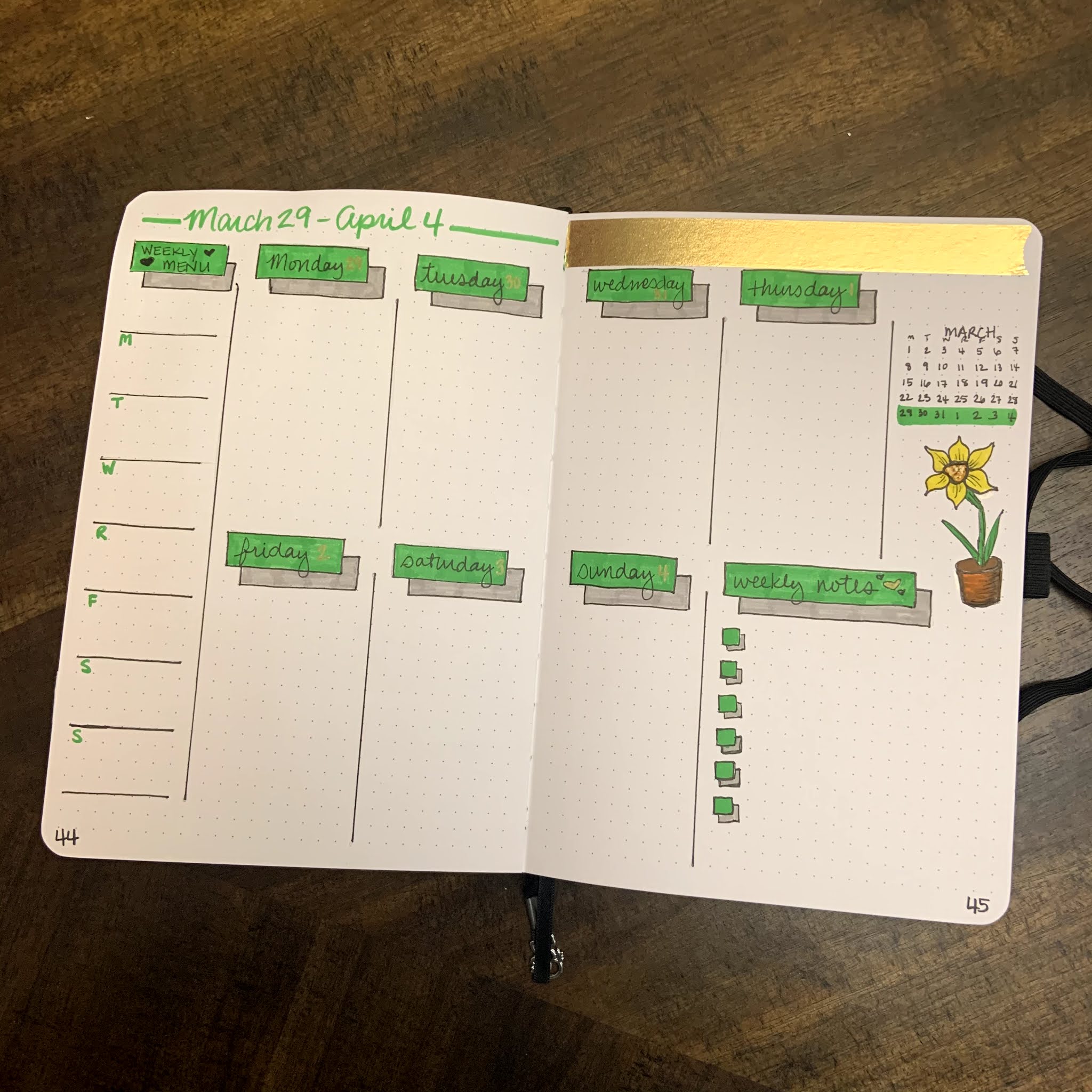
It's the beginning of March, so that means we are going to do another bullet journal flip-through! This month, I knew I wanted to go with something with a green/plant based theme. I definitely wanted to include shamrocks and yellow/gold, without doing an all out St. Patrick's Day theme. Since daffodils are the flower of March, I wanted to add some of them to the spread as well.
I did watercolor a strip for the calendar page, but I ended up liking it so much that I didn't want to cut it up. So, I used washi tapes instead this month! The result is simple, but I like how it looks! The mood tracker is a four-leaf clover, because it just felt like a fun one to do. I can't wait to see how it turns out once it's colored in at the end of March! The bill tracker is the same from month to month, only changing colors to match the theme.
This month includes 5 weeks instead of 4, so you will get a little bit of April during this month. Each week's theme was fun to do!
Week 1: Leaves
Week 2: Daffodils
Week 3: St. Patrick's Day
Week 4: Stripes
Week 5: Simple Shadows and another Daffodil
I had a lot of fun coming up with this layout, and I really enjoy the creative energy I get from using a planner that I have built myself!
Have you started your bullet journal journey? How does it inspire your creativity? What other things do you do to keep your creative juices flowing? Let me know in the comments below!
Last April I got a Scrawlrbox with some Faber Castell Albrecht Durer products, both watercolor brush pens and some of these Magnus pencils. I remember swatching the pencils and LOVING them.
Before this time, the only watercolor pencils I owned was a very inexpensive student grade set from Arteza. I'm NOT knocking those pencils and I still use them all the time! But I knew I wanted something that I could use more regularly and that had lightfastness ratings. I also wanted to invest in something that I could replace open stock, so I started watching TONS of reviews and trying to decide what I wanted to do. Here's what I learned:
1. I think the Derwent Inktense products would be amazing to own, but they are not traditional watercolors. Because of this I decided against this investment for the time being.... BUT Derwent just came out with a beautiful 24 half pan of Inktense pans... so that might be in the future!
2. There are several brands that I think are worth the money, but only one of them was something I had tested (FC Albrecht Durer). Because of this, I was much more interested in buying these pencils if I could get them.
3. These pencils look massive, but they actually work really well for my hands. I have had issues with carpal tunnel for years, and so the bigger pencils work really well for me. This pencil size was my ultimate reason for deciding to buy these over other brands.
4. The Magnus pencils are the same as the regular Albrecht Durer line, just larger. This means that if the Magnus line, which is only 30 colors right now, is missing a color, I can always just buy a regular size AD pencil open stock to supplement the set.
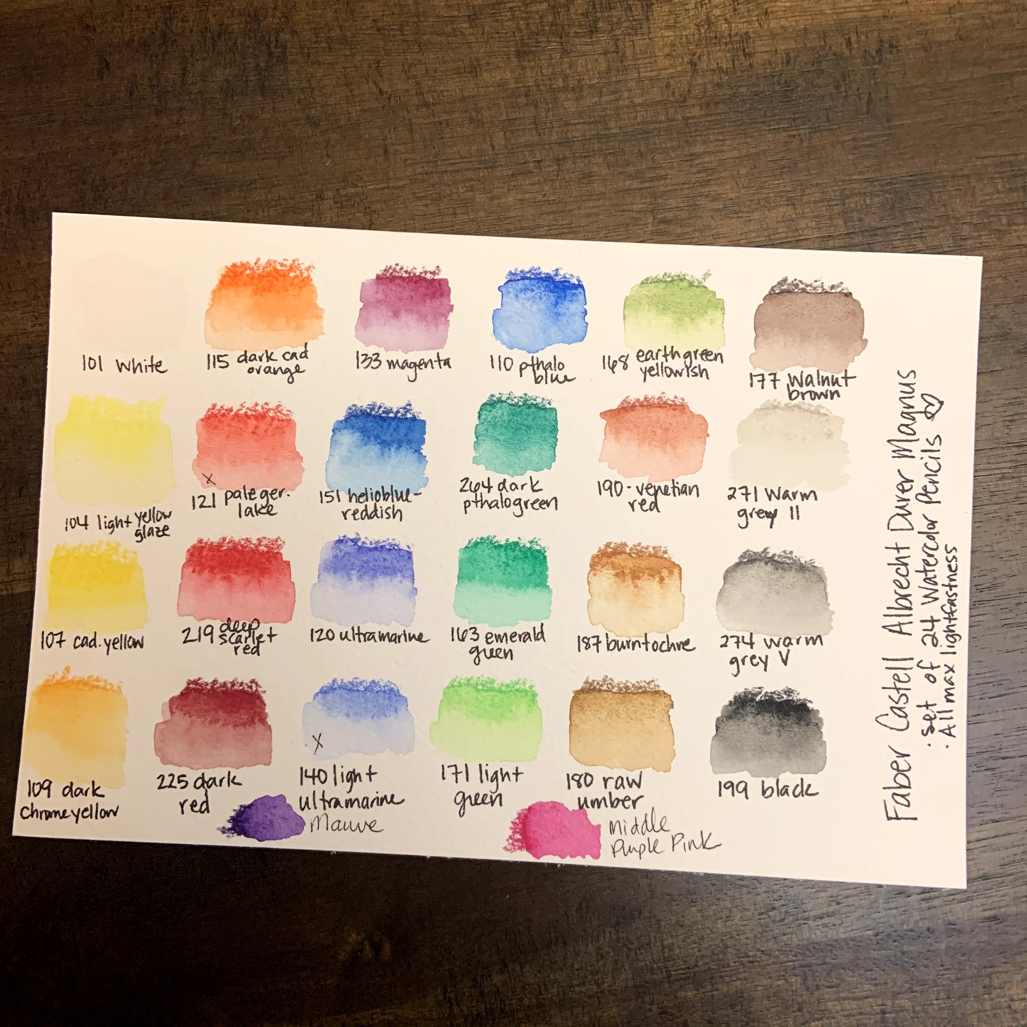
So, these were all of the things that I took into consideration before purchasing this set. I looked at Caran D'Ache Supracolor, Faber Castell AD, Derwent Inktense, and Prismacolor Premier as my potential purchases. Once I decided on the AD Magnus pencils, I got a fabulous deal on this set of 24 pencils:
Swatching and Initial Thoughts:
1. The colors are beautiful and intense!
2. The pencils are smooth and easy to use! They are large but definitely can still get fine details if they are sharpened.
3. The color range was, mostly good. I was initially frustrated because there wasn't a good cool red/pink option, or a color akin to a dioxazine purple. Both of those are kind of important if I'm going to use them for florals, so my goal was to find ways to mix those colors. I was able to get close, BUT I went searching the open stock AD Magnus pencils and found out that they had two pencils that matched those needs exactly! I bought the open stock colors and replaced them with a warm red and "ultramarine light," which honestly just seems like ultramarine with filler added. NOW I feel like my set is well balanced and will allow me to do anything I want for my personal style of artwork.
Artwork and Testing:
I have been using these for about 2 months now, and so I've tried these pencils on several different types of situations in order to give a full and robust review. Here are several of the artworks that I used these pencils on and my thoughts.
They work really well in a mixed media setting. Once set with water, they don't lift when posca pens, fine liners or bleed proof white/white gouache were used overtop of them. The resistance to the white mediums was particularly fabulous!
The pencils dissolved completely with water BUT they also kept texture and didn't let colors run together. This especially made my monstera leaf picture really beautiful.
The pencils can both cover a large area and be used for fine details.
The pencils had the ability to blend and mix an entire background beautifully. I was extremely impressed with their ultra pigmentation in that situation.
Using my Caran D'Ache pencil palette, they mix into extra colors beautifully. I cannot stress enough how great the palette is, and that it is easily the best $12 I have ever spent on a mixing palette. (I got mine on Amazon)
Final Thoughts:
These pencils are absolutely fabulous. I'm really glad that I took the leap and invested in them! There's a reason that Faber Castell is a tried and true brand and the larger pencils are a perfect fit for my needs! I love that I can buy them open stock, and I hope they expand this line so that I can buy more Albrecht Durer pencils in this size!
Have you ever tried these pencils? What did you think of them? Let me know in the comments below!
When I signed up for The Sketchbook Project, I was excited and nervous. I loved the concept, and I wanted to be a part of it, BUT putting myself out there in that way felt terrifying. If you've never heard about the project, you can read more about it here. The Sketchbook Project was created by the Brooklyn Art Library. Taken from their website, here's a little info about them:
Brooklyn Art Library is a 501c3 nonprofit organization that has been completely funded by participation since 2006. We work to ensure that we are fulfilling our mission of encouraging creative storytelling within a global community by keeping our physical library space free and open to the public, our digital library accessible worldwide, and making our collection as accessible as possible to people of all ages and skill levels through robust education programming.
I love the inclusive nature of their mission statement, and I know I had to be a part of it! When I got my Sketchbook, it was in October of 2020, and I was deep into Linktober. Linktober was huge for me this year, and it really has given me a lot more confident in my skills, even as a hobbyist. But Linktober gave the shape to the sketchbook, because I knew I wanted to draw video game characters.
I named the project "Level Up." The idea was that through the drawing of specific characters and ideas I would be leveling up my own art, so I leaned into the video game pun. I had a lot of fun drawing each individual piece, and I tried to challenge myself in different ways. I used alcohol markers, watercolors, gouache and posca pens, metallic watercolors, graphite and water soluble graphite during the course of this book. I also tried many different types of characters and even a few landscapes and full screen scenes.
I've highlighted a few of my favorite pieces here, but click below for a full, explained flip through! I also will have a faster flipthrough on my instagram highlights/story as well.
Once the sketchbook is digitized, I'll have a link here and as a tab on my page!
What are your thoughts on The Sketchbook Project? Would you ever fill one out? What would your sketchbook be about? Let me know in the comments below!
Happy February everyone! This month, I really had a good time setting up my bullet journal! I used pinks and purples (super bright and traditional) and tried to have fun with it!
Here's the first two pages for February. I know this is a bit busy, but I really like how it turned out! I wanted the hearts to feel like little bubbles all over the page! I use the goals page to plan blog entries, track my creative time and healthy choices, and to list overall monthly goals.
Next, is the calendar spread. I made this two pages instead of one this month, and I like it much better! I also have a little spot for notes there in case there's anything large I need to write down. I also continued my design from last year's journal of adding a strip of abstract watercolor that matches the month's theme. I really enjoy doing these abstract strips and use the leftovers as bookmarks to keep or gift!
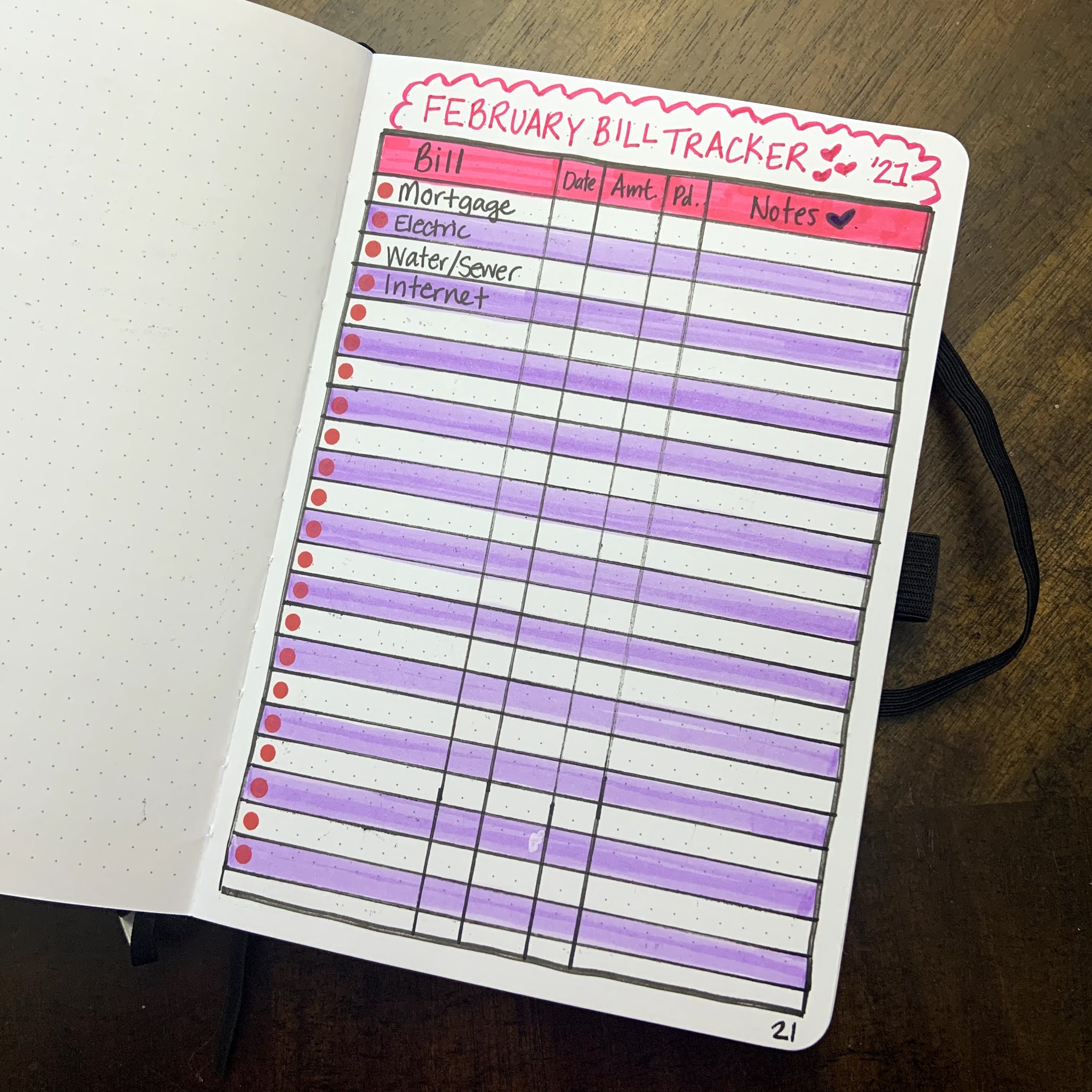
Then, I hand-draw a mood tracker and a bill tracker each month. Here are pictures of each one! I really love how the mason jar of hearts turned out for the mood tracker - so cute!
I have more bills than this - but for privacy's sake I took the picture at this point before I wrote the rest!
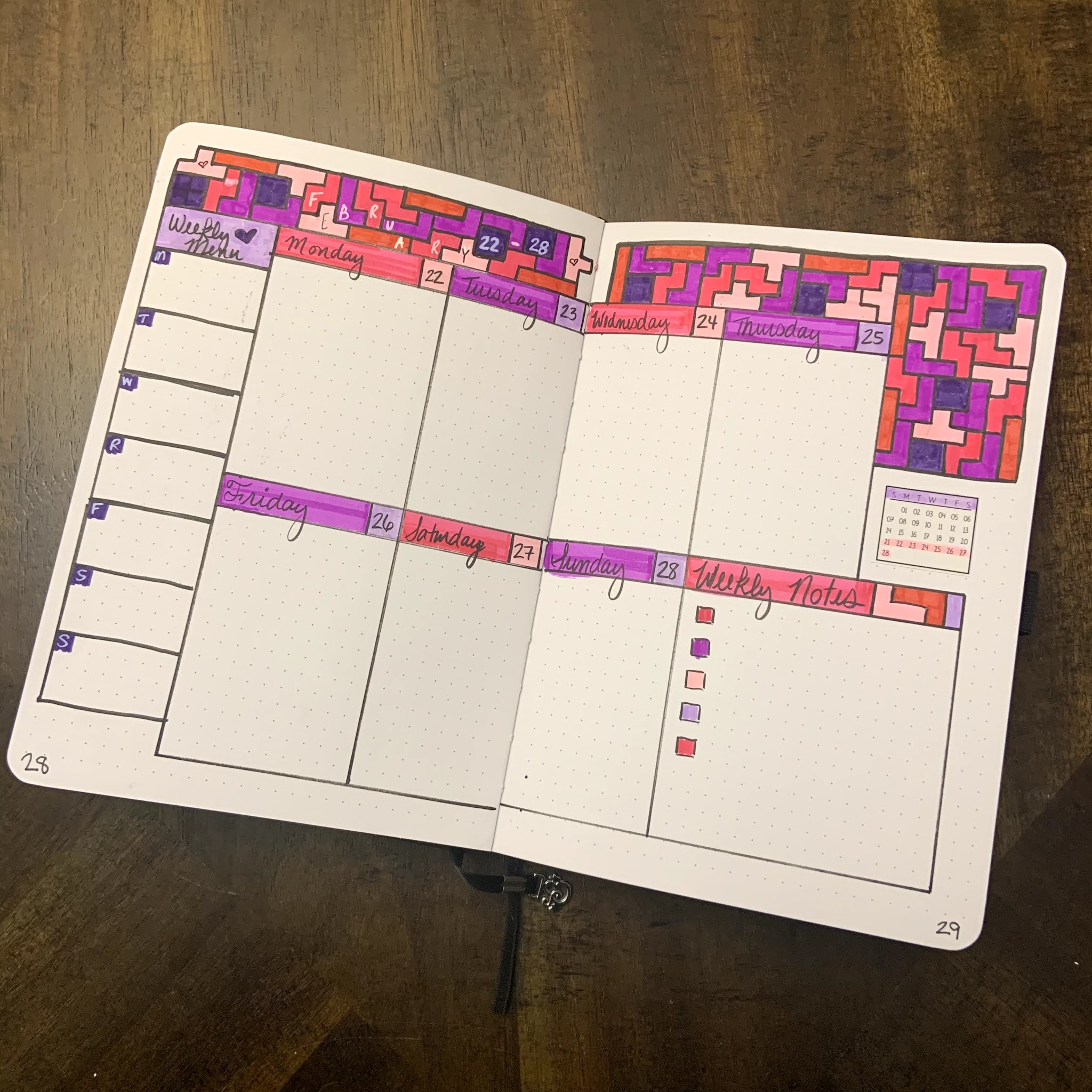
Finally, I'm including my weekly spreads for this month! I'm not sure I will include these every month, but I really loved how these ones turned out. I've settled on a weekly spread that I really like right now, it has a box for each day plus a larger one for notes, and a column on the left for our weekly dinner planning. This month, each week had a little theme:
Wk 1 - Violets (February flower of the month)
Wk 2 - Watercolor Hearts
Wk 3 - Stripes and Dots
Wk 4 - Tetris
....and that's it! I hope you guys enjoyed seeing this layout! Do any of you use a bullet journal? What was your theme of the month for February? Let me know in the comments!!