Showing posts with label watercolor art. Show all posts

Wednesday, January 26, 2022

Product Review: Rosa Gallery Watercolors


Over the holidays, I got a bunch of new art goodies! My birthday is right around Christmas, so it’s usually my time of year to spend gift cards on art goodies and to ask for things I don’t want to buy myself! This year for my birthday, my sister bought me the set of Rosa Gallery Watercolors. I got the classic set that comes in the plastic palette. Generally, I prefer a plastic palette over a metal one, and I had been very intrigued by this set. 

This set comes with full pans, says to be artist quality, and has both pigment information and lightfastness ratings. You can find that information HERE. For a pricetag around $35-$40, I HAD to know if they were quality paints!


The first thing I noticed using these was how much I loved the size of the full pans and the amazing mixing space on this palette. The paint has wonderful flow, and certain colors do granulate. I used a salt technique with at least one piece and got even more beautiful granulation, but was also able to get flat, beautiful washes for the most part.
I did notice that it seems like certain colors (violet and indigo in particular) seem to flow a LOT more than the other colors. This might just be me, but they definitely seemed to move more than others. This isn’t a problem or anything, but it is something to note if you are going to use the set.
I also missed a few, specific colors in this set. I think the olive green is more earthy than a traditional “sap green,” and while it’s not a bad color I found myself mixing sap green all the time. I also missed having a pink and a cobalt turquoise in this set, which is completely personal preference. I ended up going on Etsy and purchasing those three full pans (sap green, opera pink, cobalt turquoise) from this store, and they were a great addition to the set. The “modern” version of this set (listed here on Amazon) includes a pink and a cobalt turquoise, but I love the plastic palette so much that I’m glad I ended up with it and extra colors!

The longer I used these paints, the more their strong, vibrant pigments impressed me. The colors are just beautiful and produce gorgeous mixes and color bleeds on the paper. Everytime I sat down to paint something just for fun, I felt myself reaching for this set. This is the reason they are the first product review from my big christmas/birthday haul, because I’ve already used them SO much! So I was finding joy in the paints, and they had listed lightfastness and pigment information, so how do they compare to similar (or lesser) sets?


So - I would categorize these paints as a wonderful “starter artist” set. I would not expect them to perform as well as my Daniel Smith or M Graham sets - though in my humble opinion, they DO hold up to these sets decently well! So I’d like to compare them to the MeiLiang Pretty Excellent watercolor set, distributed by the same parent company as Paul Rubens art supplies, and to the Winsor and Newton Cotman watercolors.
The Pretty Excellent watercolor set comes with 36 half pans, lightfast and pigment information, and usually is around $20 on Amazon. You cannot purchase the colors open stock, and it does come with a nice tin.
 
 Windsor and Newton Cotmans come in all shapes and forms - so I tried to find what I would consider to be the most comparable set. Their “studio” set comes with 24 full pans (similar colors) in a metal tin and costs about $60 at the major retailers (Amazon, Blick, Jerry’s Artarama.) You can purchase these full pans open stock, and there is lightfast and pigment information attached to the paints.
Considering both of the above options, I’d consider the Rosa the clear winner here. The Pretty Excellent paints are of similar quality and cheaper, but they do not offer an open stock replacement option if you like them. You can buy individual full pans of the Rosa paints, and you get a LOT more paint for the $35 (making the price comparable in my opinion!) The Cotmans are available open stock, but their pricetag is much higher and, to be honest, I don’t think they are nearly as vibrant or pigmented as the Rosa paints.
Overall, these paints are for just about everyone! If you are a serious watercolor artist, I think you will be impressed with these but also not find them so precious that you don’t use them. If you are a beginner, this set definitely encourages you to mix colors and offers a great mixing set for landscapes and florals. If you are somewhere in between but want to try something higher quality at a budget, these are your paints! Watch here for the video review: 


Do you have these paints? Is there another set out there that they remind you of? Let me know in the comments below!

Wednesday, January 12, 2022

Product Review: EmJxCraftamo Brushes and Etchr Lab’s Signature Series Perfect Sketchbook

So this week I’m coming to you with two things that I bought myself for my birthday!  These are two items that I really wanted to have/try, and since they were both going to be limited releases I just spent some of my own birthday money on each one!  I feel extremely fortunate to have the ability to do this and I’m super glad that I did!  

I’m going to walk through the info about each of these two things and then tell you my thoughts and feeling after using each one.  


  1.  EmJxCraftamo Brush Set

Let me start by saying that if you don’t watch Emma Lefevbre on YouTube you need to stop reading this RIGHT NOW and go subscribe to her.  She is absolutely one of my favorite artists online and I’ve learned so much from her!  I went into this purchase with a good vibe, because I know that if Emma put her name on these that they are going to be a great product (she does not endorse stuff often or lightly!)  


As a watercolor hobbyist, I’ve tried a TON of round brushes.  I usually tend to prefer something that is somewhere in between super stiff and super soft.  I can work with either thing, but that’s my preference.  I was very interested in this set of bamboo brushes because they looked to have amazing points, hold a lot of water, but still to be a little bit softer than your typical synthetic brush.  I was intrigued.  I also LOVED the size choices of the set - a Round 2, Round, 6, Round 12 and ¾ Mop.  


Right away, I noticed that these brushes DO hold a ton of water for their short bristles!  This was exciting, but they also provided me with great control.  The brushes are well made and felt great in my hands.  I’ve been using them for several weeks now and the pointed tips are still as good as new.  The mop brush will work for large pages, and holds a ton of water.  The box they came in was beautiful, and the extra piece of Emma artwork was a wonderful bonus!  All in all, these are a wonderful, versatile set of brushes that I will use for a long time!  They are almost sold out, but if you want a set you can snag them here: 


https://www.craftamo.com/products/emma-lefebvre-x-craftamo


  1.  Etchr Lab Signature Series Perfect Sketchbook - B5


Etchr is another company that I absolutely trust to put out high quality items.  Their mixed media cold pressed sketchbooks are absolutely wonderful and work double sided more beautifully than any other watercolor sketchbook I have tried.  When Etchr said they were doing a limited release run of their Perfect Sketchbook I knew I wanted to grab one to use for my more flushed out art pieces.  


This sketchbook is 300 gsm cold pressed Fabriano Artistico paper.  It has 52 pages and has beautifully deckled edges.  It is a portrait sketchbook with a sewn in bookmark and a vegan leather cover.  It is absolutely beautiful and feels incredible in your hands.  


Working on this sketchbook was overall really great, but it did have a few learning curves.  I enjoy doing wet on wet watercolor pieces, and I found myself wishing I had clipped down the pages instead of just having taped off the edges.  The paper really bowed up when I was working on it, but returned to size and shape once dry.  In the future I think using a clip will work wonders.  I also find it interesting that the “fabriano artistico” stamp is visible in several pages of my sketchbook.  I painted on one of these pages to see if it would be visible in the final piece, and I think it’s still kind of obvious?  Can you still see it in the piece?  


These are TINY minor things though, and overall I really REALLY love this sketchbook.  I can’t wait to take my time and put some amazing artwork in here over the next several years!!!  These are still available on the EtchrLab website, and you can snag this one here:  


https://etchrlab.com/collections/sketchbooks/products/sigseriescp21


Full disclaimer: Both of these products are pricey.  These were luxury items I picked up for myself and probably won’t buy stuff like this again for awhile.  But I think that once in awhile it’s nice to treat yourself if you can, and even nicer to see that someone else that spent money on the product enjoys it.  I bought both of these with my own money and my opinions are mine alone.  If you’ve read the blog before, you know that I don’t sugar coat it if I think something isn’t great.  


Did you buy either of these items?  What was your favorite “Treat Yo Self” purchase you made in 2021?  Let me know in the comments below!!! 


Saturday, March 13, 2021

Product Review - Greenleaf and Blueberry Paints

This year for Christmas, my husband bought me some lovely handmade watercolor paints!  I was so excited by this, because I really wanted to try handmade paints but they are a bit pricey.  It was a wonderful gift idea and I was so excited!  He purchased me 4 starter half-pans from Greenleaf and Blueberry, a small US company specializing in art supplies for the traveling artist.  I was SO excited to get these paints!  

He started me out with a very earthy set of colors, and I was very glad for that because I love landscapes!  The four colors I'm reviewing are: 

  • Red Ochre
  • Green Earth
  • Pthalocyanine Green
  • Vivanite
Per the website, here's what the seller has to say about each of their paints: 
The Paint:
-Artist Grade
-Single Pigment
-Lightfast
-No Fillers, brighteners, or dispersants
-Pure, Genuine, Natural Pigments
-Made Traditionally By Hand With Muller & Slab
-Artist & Chemist Formulated

I have done several projects with these paints, both on their own and in conjunction with other watercolors to see how they would do in several arenas.  Here are some things I thought were notable: 
  • Red Ochre and Pthalo Green were beautifully pigmented.  I actually gasped when I swatched them I was so happy.  They also mix beautifully with other artist grade paints.  The Red Ochre is a bit more opaque than the Pthalo Green, which is exactly as it should be.  I was very impressed with these paints in the upfront tests.  
  • Green Earth is a beautiful color but it is a weaker shade.  It takes a lot of work to get a big pigment payout, and it is weaker in mixes than the first two.  I still really like this color, but I have come to use it as a stand-alone and not as a mixable color.  
  • Vivanite.  Holy cow guys.  This color is probably one of the coolest paints I've ever owned!  It's very pigmented but the GRANULATION is out of control amazing!  It is similar in color to Payne's Gray, but it adds so much richness and complexity to a piece because of the granulation!  It works beautifully as a background or in landscape painting.  I'm just in love with it!  
Here are some paintings I've done with these paints (some standalone, some mixed), and my thoughts on each:  


This was my first painting done with these paints.  I really enjoyed how beautifully they worked to make an easy landscape painting.  The Vivanite as a background is just so lovely here, and you can really see how beautifully contrasting the two green shades are.  


This was a fun sketchbook "rocks" activity I did, mainly to see pigmentation, granulation, etc.  I had to work much harder to get the Green Earth to stand up in this piece to the other colors, but it does stand up to them with a little extra work!  Once again, you see how BEAUTIFUL the granulation is on the Vivanite here.  The gray is really what makes this piece look like rocks instead of blobs in my opinion!  I love that paint!  


Here I used the paints to do a little teacup.  I don't love this piece but I do love how these paints laid down as full background washes!  The Vivanite mixed very well into the other paints here to create shadows on objects, which was really great too.  


This little painting was done with some G&B paints and other handmade watercolors mixed together.  I mixed the Vivanite with Ultramarine Blue in order to get the background gradient, and I mixed the Pthalo Green with the same Ultramarine Blue to get the water.  The sand is the Red Ochre, mixed with a smidge of Lemon Yellow.  These paints mixed beautifully and created a really lovely little beach scene here.  


Finally, I used all four paints, along with several other colors, to create this Spring wreath.  Here you can see that the paints do a nice job of layering and glazing, something I hadn't really done with them in the other paintings.  

These paints have been a fabulous foundation to my handmade watercolor collection.  Would I buy more of them?  Absolutely!  I am definitely going to look into more of their granulating colors, and I would love to have a few more of their earth tones to enrich my palette further.  If you are in the market for handmade watercolors, I would *highly* recommend Greenleaf and Blueberry!  

Have you tried handmade watercolors before?  What do you think of these paints?  Let me know in the comments below!  

Tuesday, February 23, 2021

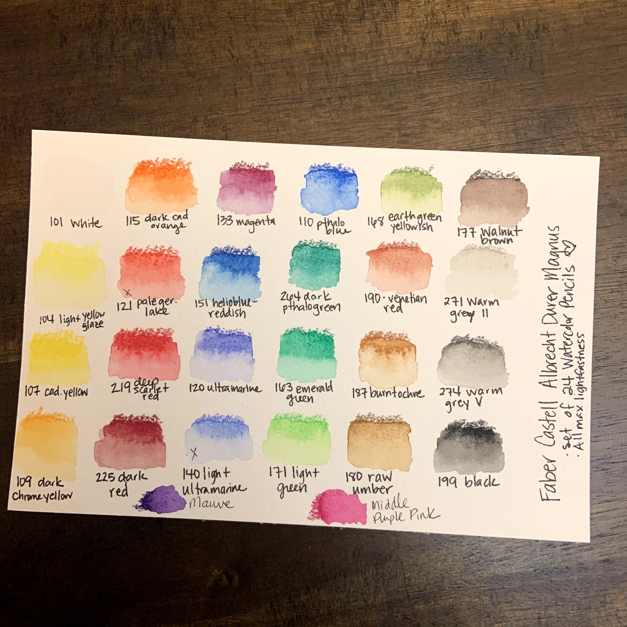
Product Review: Faber Castell Albrecht Durer Magnus Watercolor Pencils

 Last April I got a Scrawlrbox with some Faber Castell Albrecht Durer products, both watercolor brush pens and some of these Magnus pencils.  I remember swatching the pencils and LOVING them.  

Before this time, the only watercolor pencils I owned was a very inexpensive student grade set from Arteza.  I'm NOT knocking those pencils and I still use them all the time!  But I knew I wanted something that I could use more regularly and that had lightfastness ratings.  I also wanted to invest in something that I could replace open stock, so I started watching TONS of reviews and trying to decide what I wanted to do.  Here's what I learned:  

1. I think the Derwent Inktense products would be amazing to own, but they are not traditional watercolors.  Because of this I decided against this investment for the time being.... BUT Derwent just came out with a beautiful 24 half pan of Inktense pans... so that might be in the future!  

2. There are several brands that I think are worth the money, but only one of them was something I had tested (FC Albrecht Durer).  Because of this, I was much more interested in buying these pencils if I could get them.  

3. These pencils look massive, but they actually work really well for my hands.  I have had issues with carpal tunnel for years, and so the bigger pencils work really well for me.  This pencil size was my ultimate reason for deciding to buy these over other brands.  

4. The Magnus pencils are the same as the regular Albrecht Durer line, just larger.  This means that if the Magnus line, which is only 30 colors right now, is missing a color, I can always just buy a regular size AD pencil open stock to supplement the set.  

So, these were all of the things that I took into consideration before purchasing this set.  I looked at Caran D'Ache Supracolor, Faber Castell AD, Derwent Inktense, and Prismacolor Premier as my potential purchases. Once I decided on the AD Magnus pencils, I got a fabulous deal on this set of 24 pencils:  

Swatching and Initial Thoughts: 

1. The colors are beautiful and intense!  

2. The pencils are smooth and easy to use!  They are large but definitely can still get fine details if they are sharpened. 

3. The color range was, mostly good.  I was initially frustrated because there wasn't a good cool red/pink option, or a color akin to a dioxazine purple.  Both of those are kind of important if I'm going to use them for florals, so my goal was to find ways to mix those colors.  I was able to get close, BUT I went searching the open stock AD Magnus pencils and found out that they had two pencils that matched those needs exactly!  I bought the open stock colors and replaced them with a warm red and "ultramarine light," which honestly just seems like ultramarine with filler added.  NOW I feel like my set is well balanced and will allow me to do anything I want for my personal style of artwork.  

Artwork and Testing: 

I have been using these for about 2 months now, and so I've tried these pencils on several different types of situations in order to give a full and robust review.  Here are several of the artworks that I used these pencils on and my thoughts. 


  • They work really well in a mixed media setting.  Once set with water, they don't lift when posca pens, fine liners or bleed proof white/white gouache were used overtop of them.  The resistance to the white mediums was particularly fabulous!  
  • The pencils dissolved completely with water BUT they also kept texture and didn't let colors run together.  This especially made my monstera leaf picture really beautiful.  
  • The pencils can both cover a large area and be used for fine details.  
  • The pencils had the ability to blend and mix an entire background beautifully.  I was extremely impressed with their ultra pigmentation in that situation.  
  • Using my Caran D'Ache pencil palette, they mix into extra colors beautifully.  I cannot stress enough how great the palette is, and that it is easily the best $12 I have ever spent on a mixing palette.  (I got mine on Amazon)
Final Thoughts: 

These pencils are absolutely fabulous.  I'm really glad that I took the leap and invested in them!  There's a reason that Faber Castell is a tried and true brand and the larger pencils are a perfect fit for my needs!  I love that I can buy them open stock, and I hope they expand this line so that I can buy more Albrecht Durer pencils in this size!  

Have you ever tried these pencils?  What did you think of them?  Let me know in the comments below!  

Tuesday, February 9, 2021

February Sketchbox - Water Soluble GRAPHITE!!!!!

 Another month, another Sketchbox!!! I must admit, I've been playing around with this box of supplies for over a week now and I'm just HAVING SO MUCH FUN!  More on this later!  

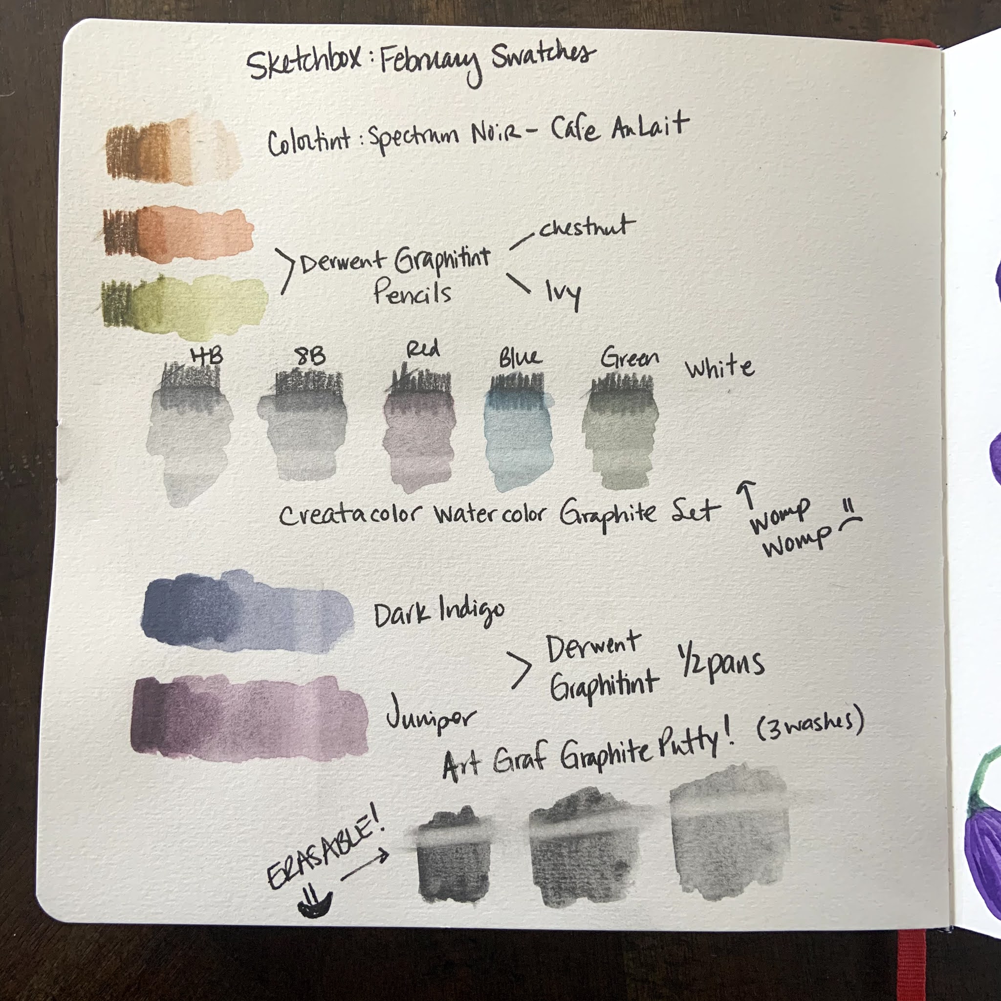
Let's start with swatches, what's in the box, and my thoughts on each item in the box:  

Supplies: 

  • Princeton Heritage Brush - Round #6 
    • This is a beautiful paintbrush.  I enjoyed using it very much!  Valued at $14, I would have settled for something a little less expensive if it meant getting an eraser in this box. 
  • Derwent Graphitint Half Pans - Dark Indigo and Juniper
    • These. Are. Amazing!  I have seen people use these online before, but I was NOT prepared for how awesome they are!  I really want the whole set now!  The colors were beautiful and granulated so nicely.  They of course are the quality I expect from Derwent.  These erased a bit, but not completely. 

  • Derwent Graphitint Pencils - Ivy and Chestnut
    • These were also pretty darn awesome!  I loved the colors and they dissolved quite nicely when using water on them.  These erased a bit, but not completely.  

  • Spectrum Noir Colortint Pencil - Cafe Au Lait
    • This was a nice pencil as well!  I didn't love it as much as the Graphitint pencils, but it was still a nice, dissolving pencil and it was great to have two different browns to create nice contrast.  This pencil *did* have a more clean erase than any of the Graphitint products, which was great.  

  • ArtGraph Drawing Graphite Putty
    • I was terrified of this package when I saw it.  I waited DAYS to open it.  When I opened it, I used a tiny scoop to take a VERY small amount out into my palette.  As soon as I put the paintbrush to it I was IN LOVE!  This stuff is literally liquid graphite.  I loved being able to use graphite like paint.  But THEN the best part - YOU CAN ERASE IT!  That's right!  It takes a little more to erase than dry pencil, which is perfect because you can draw on top of it and do a light erase without messing up the under layer, but you can also erase it to create highlights!!!!!  WHAT!?!?!  This is the star of the box, and I'm so excited to use it in the future too! One small thing I'd wished was that the plastic bag had a zip top instead of a tear open top so that I could easily keep it sealed.  But this stuff was AMAZING!  

  • Cretacolor Watercolor Graphite Set, 6 pc
    • Finally, these were decent!  I LOVED the two graphite pencils, the blue and the green.  They were high quality.  These pencils dissolved decently well and they erased pretty well too.  BUT, the red was weak, and was almost the same color as the juniper Graphitint so it didn't really get used much in my piece.  And the white, the white was absolutely useless.  It didn't layer over anything, it didn't write over any of the other graphite, and I didn't use it at all.  I even tried to scribble a bunch of it out and pick it up with a paintbrush to go on the top of the other graphite, and it did... nothing.  I'd much have preferred a 4 piece set here and a swap out for those two pencils for an opaque white medium.  

Quick Notes: 

  • We didn't get paper this month.  I'm totally fine with that because the value of the rest of the box was great!  Also - Sketchbox has sent plenty of wet media paper in recent boxes, so everyone should have something to put their art on/in.  
  • I definitely benefited from having the Caran D'Ache Palette Aquarelle.  (Palette pictured below.) This is a palette with a smooth side and a rough side, designed to scribble out pencils and pick them up with a wet brush.  It is easily the best $11 I've ever spent on a palette.  I'd HIGHLY recommend it if you ever use watercolor pencils!  
  • I used the TINIEST bit of graphite putty!  I have a picture of the palette I used for that so you can see that a little really does go a long way with that stuff!  

Caran D'Ache Palette Aquarelle and my Palette with the Graphite Putty

Box Value: Sketchbox values this box at $52.93 and I have to say it's definitely worth my money!  I will use 90% of what's in this box over and over again for a long time to come.  The *only* thing I would say is that the Creatacolor red and white weren't very useful, and I would have traded them out for a nice eraser and a white opaque medium that actually layers over the graphite.  

That being said...  

This box was AWESOME.  This is exactly what an art subscription should be and should provide.  I would *never* play with graphite on my own accord, but give me graphite the works like watercolor and BAM - I'm pricing out Derwent Graphitint everything online!  And that graphite putty is one of the coolest things I have ever gotten in an art box.  GREAT JOB Sketchbox!  

What did I draw? I knew *immediately* when I saw how the graphite putty worked that I had to draw a statue!  And so of COURSE I drew Hylia from Skyward Sword!  I knew right away that the indigo Graphitint would look amazing as a dark sky.  I also used the pencils and half pans to create a cobblestone path.  I used both green and brown pencils to create the trees, that turned out whimsical just like the trees from Skyward Sword.  I used a combination of wet and dry graphite for Hylia herself.  I'm so very pleased with how this piece turned out!  

Have you ever played with water soluble graphite?  What would you make with this Sketchbox?  Let me know in the comments below! 

Friday, December 11, 2020

December 2020 Sketchbox - WOW!

 Guys - I was excited about this Sketchbox because I knew it was water-soluble products and it DID NOT DISAPPOINT!  

Here is my swatch card and my thoughts on each product in the box:  

1. Sketchbox Signature Watercolor Pencils

These were beautiful!!!  I really loved the color palette this month - the earthy and muted tones were beautiful and screaming for a landscape. These pencils colored beautifully and dissolved into a fabulous lighter version of their scribbled color.  I really enjoyed using them - they are as good or better than my mid-range watercolor pencils. I loved using them!  

2.  Marabu Art Crayons - Terracotta and Caramel

These were a huge surprise - and I LOVED them!  I didn't expect to like them, they didn't seem like something I would enjoy but they were lovely!  They added a great texture to both of my pieces, especially for woodgrain and terrain.  They dissolved really nicely but with pressure the texture was awesome too.  I might pick up a set of these in the future I liked them so much!  

3. TCW Watercolor Sparx Powder

I have worked with Ken Oliver's watercolor powders before and I love them - but this powder was super quality and vibrant.  I loved that it had several colors in the bottle - that added so much dimension!  I can't wait to have more fun with this powder in future projects.  This was easily the star of the box for me!

4.  Holbein Artist Gouache - White

This is a fabulous white gouache. I love all of the Holbein gouaches and this was a perfect highlight on the toned paper. I have complained for two boxes about not having a perfect white highlight medium - so I was so glad to see this in the box.  Great addition to the box!  

5. Custom Hahnemuhle Toned Watercolor Pad

I thought at first that this paper was going to be too thin to hold up - but it was surprisingly great!  I have never bought toned watercolor paper and was super excited to try it - and I totally understand why people like it.  After my first landscape picture I knew I wanted to do a dancer because I wanted to try a person with the toned paper and I really loved how that turned out too!  

6.  Marabu Fluid Arts Brush - 3pc Set

These are water brushes - and they were decent brushes!  I'm not a huge fan of water brushes.  I'd always rather have a regular brush than a water brush, especially because we always seem to get water brushes in these boxes.  I'd argue that most people have water and a container available, so I'd always rather have a regular brush. 

7.  Derwent Line Maker - 0.8 Black

This is a great fineliner but THIS IS NOT A WATERPROOF PEN!  It was the one thing in the box that was a disappointment because I wish the box had clearly indicated that this pen was not waterproof.  The card simply says - "try layering it over your watercolors!"  which to me did not indicate that it wasn't waterproof.  I just about ruined my dancer picture because of this - though I pivoted and I think my idea was a good one!  This is a great marker but I would have really liked a waterproof addition to the box for line work.  

So these projects turned out really nice!  I had a lot of fun trying different techniques on both pictures.  

Tree Landscape

Ballet in the time of Covid

Did any of you get this sketchbox?  What did you think about the products! Leave me a comment with your thoughts!  


Tuesday, November 17, 2020

Easy Watercolor Christmas Cards

Christmas cards, already?  I know, I know, it's not even Thanksgiving yet in the states!  But if you know me, you know that I make Christmas cards pretty much all year so that I have enough to send out to our very wonderful and large list of family and friends!  By the time we reach November, I'm pretty much looking for a quick and easy type of card with maximum wow factor but minimum effort.  Honestly, that's pretty much ALWAYS the goal!  

This year, I really wanted to get more use out of my metallic watercolor set.  I love this set of paints from Paul Rubens:  

This is the second most expensive watercolor set I own (behind my artist-grade watercolors), and while I love it, I rarely get it out and play with it!  I made it a point last weekend to just get it out and use it, and I ended up with some really great designs!  


1. First, I cut black paper down to 4.25 by 5.5" squares.  I ended up trimming a few of them down and leaving the others the size of the card front.  I used Strathmore black mixed media paper for some of them and Astrobrights black 65lb cardstock for others.  I did NOT buy expensive black watercolor paper for this project - so use what you have!  

2. I painted!  My first picture was a fir tree that I let dry and then spattered on lots of different colors.  The second was a bunch of holly.  The third was a round ornament that I used as the O in Joy.  The fourth was a Christmas wreath that took me a little longer, but I just layered and played with leaf and pine shapes until I got it where I wanted it, and then added berries for a pop of color.  

3. Assemble!  For 3 of the 4 pictures, I added a sentiment (the JOY card didn't need one!).  To do this, I used Christmas sentiment strips that I bought at Simon Says Stamp, and I die cut some words from a Christmas die cut set that I have from Newton's Nook.  For this step, I'm using supplies I already have.  If you don't have Christmas word die cuts OR premade sentiment strips, you could use stamps, write a sentiment with a gel pen, or paint a sentiment with brush lettering!  The point of a handmade card is for it to look handmade, so don't fuss too much if it isn't perfect!  

It felt really good to spend some time using some supplies that I don't use normally.  I was really pleased with how all four of these cards turned out - and I can't wait until they spread some Christmas cheer to family and friends!  


I hope this post gives you some holiday inspiration to get out there and create!  


Tuesday, November 10, 2020

Welcome!

 Hi everyone - welcome to Artsy Bits by K - the blog!  I just decided that I don't love long Instagram posts, and that sometimes I'd like to say more about my art process than just a tiny blurb.  

I am just someone that is having fun with art supplies.  Please know that I'm not an expert by any means and that my opinions are just that.  I've been having a lot of fun in the past year using art as a creative outlet during this year of quarantine and it's been a blast.  

Here are two of my favorite pieces that I did for Linktober this year - a picture of Levias from Skyward Sword and the Koroks from Windwaker.  I was super happy with how these both turned out and have learned that for character creation I'm really in love with hot press watercolor paper.  


I hope that you enjoy my journey and feel free to leave a happy comment here or there!