Showing posts with label brush markers. Show all posts

Wednesday, January 5, 2022

2022 Bullet Journal Setup and January Theme

Happy 2022 everyone!  It’s a new year, and you know what that means - a new bullet journal!!!  Last year I bought a beautiful journal from Archer and Olive and while I enjoyed it a lot, there were a few things about it that I found myself wishing for it.  


  1. I had 192 pages and that was barely enough.  I found myself trying to find ways to double up a few weeks in order to have enough room.  

  2. I really wished I had a spot at the beginning of the journal to put things like important dates etc… but I hadn’t allotted for that because of the number of pages.  


Still, I really loved a LOT of things about this journal.  My favorite things about it were: 

  1. The pages were super thick, and so I could do just about anything to them (except alcohol markers), and they wouldn’t ghost at all.  This included all of my water based pens, watercolors, fineliners, and gouache.  It was glorious and amazing.  

  2. The size and layout of the dot grid was awesome and I knew I wanted the same again.  I keep my layouts pretty standard from month to month and my weekly layout never changes, so I knew I wanted that same size and grid pattern.  

  3. I liked the built in bookmarks and back pocket and wanted those features again.  


So, I spent a LOT of time considering journals.  I wanted to keep my budget around $30-45, but I also wanted the similar quality and more pages.  I did a lot of looking and researching, and I came across Vivid Scribbles Company.  They had a 200 page journal that claimed an Archer and Olive level of no ghosting, and that also included extra pages like an index in the front and pen test spot in the back.  What’s even better is that this was all for $24.99!!!!  I figured it was too good to be true, but for the price figured I’d definitely buy one to try.  I got this journal a few months back, and this particular color seems to be discontinued but here it is:  


I tested several types of pens on the pen test page, along with 2 different kinds of watercolor.  The book has no ghosting for any of the tests I tried!  I’d even say that each type of pen took 4-5 passes on the pages well before I was concerned at all about tearing.  I rarely would do that many passes, if ever, so I’m super pleased with these tests.  The index and key etc… at the front is a great addition to the book, and this one has 3 ribbons instead of the 2 on the Archer and Olive notebook.  Theirs had a fancy metal weight at the end of each ribbon, and while that is a nice detail it’s not necessary and I don’t miss it!  


I got my journal at the Amazon link listed here, and I also am going to link the Vivid Scribbles main site too!  So far, this has been a wonderful bullet journal option and I’d recommend it to anyone that is looking for a solid, affordable bullet journal!  


This year, along with an index that I’m going to do by month, I also allotted a page for important dates, and have one more blank page to use as needed.  I also always make a page in the front for all of my friends and family birthdays and anniversaries, and a spot to categorize the books I’ve read.  I added a spot for movies and games too this year to that page!  


Finally, my monthly spreads are a little different this year.  I’m making my mood trackers smaller and adding other monthly habits to the same page.  Then, with my extra page I’m dedicating a page each month for planning for YouTube, Instagram, Twitch, and this blog.  So far I’m super happy with how this is turning out!  This month I went with a cool colored striped sweater theme, and my mood tracker is a snowman’s scarf. 


Here’s a video that goes through the whole thing and shows off all of the details! 


Do you keep a bullet journal?  How do you lay yours out?  Let me know in the comments below!


Saturday, April 3, 2021

Bullet Journal Journey - April 2021

 Happy April everyone!  Can you believe it's April already?  This month, I'm ready for sun and some warmer weather, so a warm color palette was definitely on my mind.  I ended up doing a honeycomb/honeybee kind of theme that I really love.  The cover page turned out SO cute!  I drew some daisies on there too, as daisies are the flower of the month of April.  I kept up with the theme for my goals page, adding more honeycombs and colorful dots:  

The calendar page went back to having a watercolor strip along the side and then I added the honeycombs overtop to tie it to the theme: 

Then, my mood tracker is made with honeycombs.  This isn't a terribly unique one this month, but I really love how it turned out all the same!  And my bill tracker page is always the same format with colors that match the theme of the month.  

Lastly, here are my weekly spreads.  I have to admit, I wasn't too creative with these this time.  I have a LOT of other creative things brewing right now, and so I just put down a base design on each page that I can doodle along with or over on each page as each week comes along!  


And there you have it!  I really love this journal and I'm so glad to have this fun and creative outlet each month!  What did you do for your April spread?  What colors do you gravitate towards this time of year?  Let me know in the comments below!  

Tuesday, March 23, 2021

Metallic Pen Roundup and Review

Hello hello!  Over the winter, I randomly acquired several different brands of metallic pens.  I started with some metallic pens in the 2020 Holiday Sketchbox, and in a set of acrylic paint pens I bought for my daughter.  Then, I picked up a cheap set on Ali Express and Zulily.  Finally, in preparation for this blog I purchased two more budget brands, one on Amazon and one at Dollar Tree.  This ALL started because I noticed that my expensive set of metallic pens seemed to look a lot less shiny than my other, cheaper sets.  Therefore, I set out to see which ones were worth the money! 

I did a full test on black paper, which is the main place I would use metallic pens.  

I did NOT consider the following things: 

  • Ability to work on non-paper mediums
  • Longevity of use - I didn't consider this because most of the time, metallic pens don't last a long time.  I'm lucky if I can get 1-2 years of use out of them, regardless of their price.  Because of this, I didn't buy copies to try to run them dry.  
  • Nib size - A lot of these pens had nibs that were similar in size but not exactly the same.  I did not feel it necessary to buy new ones in matching nib sizes, and also did not count that for or against any of the pens.  I *did* note if you could only get the pen in one nib size because that does seem important!  
Here are the things that I DID judge each one on:  
  • Price, both total price and per pen price.  I also considered if you could buy the metallics separately from larger sets of markers as that can also not be cost effective. 
  • Pigmentation
  • Shininess once dried
  • For the gold specifically, the ability to look gold and not "silver gold."  Some metallic pens have a lot more silver in them than their actual pigment color. 
  • Accessibility for me.  This won't be the same for everyone, but should be pretty similar for most in the United States at least.  
Ok so without further ado, here's my swatch AND my thoughts on each pen set.  The list is in the swatch order, I will discuss favorites/least favorites at the end of the blog.  


1. Faber Castell Pitt Artist Pen
Pros: 
  • Accessible.  Amazon and Blick have them.  
  • They come in packs of 3 or 4, so you don't have to buy a bunch of things you don't need to get the metallic pens. 
  • Nibs are high quality
Cons: 
  • Expensive.  These were at the high end of our prices, which would be ok except... 
  • Poor pigment payout.  This set was by FAR the worst pigment payout of all the pens tested.  It was really disappointing! 
2. Baoke Metallic Craftwork Pens
Pros:
  • Accessible!  I got these on Ali Express, which takes awhile to get, but I also found them for a little more money on Amazon.  The Amazon listing, depending on how many you bought cost anywhere between $1.74 per pen (4 pack) to the same $0.83 per pen (12 pack).  
  • Pigment!!!!  Holy moley these pigments were beautiful!  I didn't think I would get pigments this good from a non-paint pen.  
  • They come in packs of gold and silver only, so you don't have to buy other colors to get the metallics. 
Cons: 
  • These only seem to have one size of nib, and while I'm not holding the nib quality against it, you would not be able to get fine details easily with these pens.  
3.  Crafter's Square Metallic Marker
Pros: 
  • Affordable!  Price is $1 per marker and you buy them separately.  
  • Markers are smooth and pigmented.  
Cons: 
  • I know on the swatch I said these are accessible, but that's because I have a Dollar Tree right near my house!  These are only available at the Dollar Tree, and so if you don't have a Dollar Tree locally, they might be hard to find.  
  • This is one of two gold pens that has that "silver gold" sheen that I was talking about.  But the pigment payout is STILL better than the Faber Castell Pens in my opinion. 
4.  Sargent Art Metallic Markers
Pros: 
  • Accessible.  I bought these from Zulily with other art supplies, but Amazon also sells them for the same price.  
  • Affordable!  
  • The nibs on these markers are really nice and flexible and felt very high quality.  These were my favorite nibs!  
  • Pigment payout on these markers was good and they were shiny!  
Cons: 
  • The markers come in a pack of 6, which has other colors.  This is a con for me, because I will definitely use the gold and silver faster than the other colors and won't be able to easily replace the gold and silver.  
  • This was the other set of pens with the "silver gold" sheen on the pens, and it was probably the worst of the two.  
5.  Miaosun Acrylic Paint Pens
Pros: 
  • Accessible. I got these on Amazon.  
  • Reasonably affordable.  These were actually on the higher end of our price point at $1.25 a pen.  
  • Excellent pigment payout.  Being a paint pen, this one was immediately superior to everything that came before it.  
  • Pack of 8 had 3 gold, 3 silver, 1 black and 1 white in it.  This is good for replacing the pens.  
Cons: 
  • These *were* on the upper end of the price point at $1.25 a pen, but I'm really just stretching there to find a con.  
6. AROIC Acrylic Paint Pens
Pros: 
  • Super affordable!  This was the most affordable pen I tried!  
  • Accessible!  This one was an Amazon buy.  
  • Excellent pigment payout, very similar to the other paint pen above.  
Cons: 
  • These two metallic pens came in a set of 24, and I couldn't see a way to just buy the gold and silver on their own.  I've already used both the gold and silver quite a bit from this set, and so I wish they would sell the metallics separately.  
  • The gold had some glitter in it, which helped with the shine but was definitely a surprise. 
Specialty Pen: Molotow Liquid Chrome Pen

Pros: 
  • Best silver color that I own.  Pigment payout is incredible, and shine is beautiful!  
  • Accessible!  These can be purchased on Amazon or Blick.  
  • Comes in several different nib sizes.
Cons: 
  • Each pen runs about $10-12 depending on nib size etc.  These are SUPER pricey pens!  I got one in an art box after I bought one myself, otherwise I wouldn't have two of them!  

Ok, so who wins the battle?  

Top 3 picks (one for large coverage, one for details, one special consideration): 
  • Baoke Metallic Craftwork Pen
    • This pen was affordable and had excellent pigment payout!  It comes in metallics only sets, and has a nice sized nib for coverage!  
  • Miaosun Acrylic Paint Pens
    • These pens are affordable and also had excellent pigment payout!  This comes in a metallics plus black and white paint pen set, which is very reasonable for the price.  These pens also had the best pigment payout AND have a nice, fine nib to get into the details!  
  • Molotow Liquid Chrome Pen - Special Consideration
    • This pen is amazing but it was EXPENSIVE.  I've only had both of mine for about 5-6 months, but so far they both still work great.  This is definitely not a budget brand, and doesn't have a gold counterpart that I have discovered to date.  But this one does work really well!  
Bottom 2 picks: 
  • Sargent Art Metallic Markers
    • These weren't expensive, but they were the same price as other budget pens that performed better.  They also only come in a set of 6 colors as far as I could find, and so you cannot buy the gold and silver separately.  
  • Faber-Castell Pitt Artist Pens
    • Easily, these were my biggest disappointment! I got these in an art box, BUT they are expensive pens and they had a really disappointing pigment payout!  I would definitely pay for any of the other brands before I'd buy these again.  
I know I didn't test every type of metallic pen or marker out there, but I figured I had a pretty large cross section here to consider!  Which brands would you like to see me test in the future?  Sharpie? Posca?  Let me know in the comments below!  

Tuesday, March 2, 2021

Bullet Journal Journey - March 2021

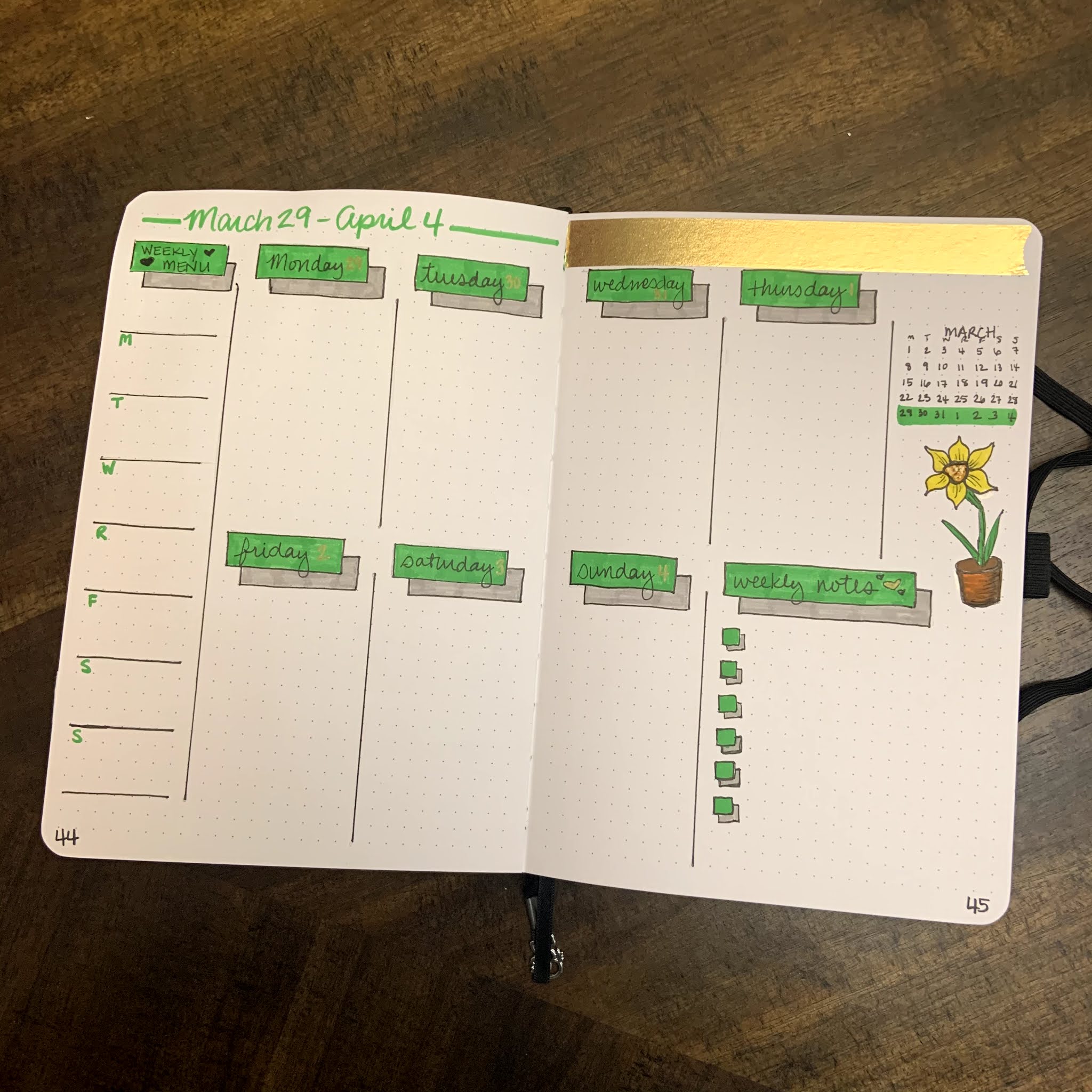
It's the beginning of March, so that means we are going to do another bullet journal flip-through!  This month, I knew I wanted to go with something with a green/plant based theme.  I definitely wanted to include shamrocks and yellow/gold, without doing an all out St. Patrick's Day theme.  Since daffodils are the flower of March, I wanted to add some of them to the spread as well.

I did watercolor a strip for the calendar page, but I ended up liking it so much that I didn't want to cut it up. So, I used washi tapes instead this month!  The result is simple, but I like how it looks!  The mood tracker is a four-leaf clover, because it just felt like a fun one to do.  I can't wait to see how it turns out once it's colored in at the end of March!  The bill tracker is the same from month to month, only changing colors to match the theme.  


This month includes 5 weeks instead of 4, so you will get a little bit of April during this month.  Each week's theme was fun to do!  

Week 1: Leaves


Week 2: Daffodils 


Week 3: St. Patrick's Day

Week 4: Stripes

Week 5: Simple Shadows and another Daffodil 

I had a lot of fun coming up with this layout, and I really enjoy the creative energy I get from using a planner that I have built myself!  

Have you started your bullet journal journey?  How does it inspire your creativity?  What other things do you do to keep your creative juices flowing?  Let me know in the comments below!  

Saturday, February 20, 2021

Paletteful Packs February - Micron and Brush Pens

 I know I said no more subscription boxes (maybe I only said it to myself... but I did say it!), BUT after I watched other people online opening the last two Paletteful boxes, I KNEW I had to give it a try!  I mean, first they got Golden acrylics and THEN they got Daniel Smith watercolors?!?!?  The value in these boxes was INSANE, so I had to try it.  

Well.  I have to say that this box was.... underwhelming at best.  Let me be clear, the items in the box are good items, but the value was just not there for me.  Let me go through each item and explain in further detail.  

Here's the items and the swatch card, and then explanations of each item and my feelings.  

Swatches

Back of Swatch Page


Tombow Dual Brush Markers - 3 Green Shades

I love Tombow brush markers.  These were the best part of the box for me.  We got three different green shades and while that was nice, 2 of them were greens I already have and I only own like 15 Tombow brush markers.  That isn't Paletteful's fault but it would have been nice to get something I didn't already have.  I also would have enjoyed at least 2 more Tombow brush pens, maybe a neutral brown or gray and a complementary color like Pink or Orange.  

Denik Sketchbook

This sketchbook was, just ok.  The artwork is beautiful, and I do really like that it was customized by Alice, whose artwork is always fantastic.  The paper wasn't great.  It was thin, and did not hold up very well to the brush markers.  Brush markers are water-based, and so when I tested them with water the paper didn't hold up at all.  There was pilling and warping and bleeding through.  This isn't that big of a deal, but I would have preferred them to use Mixed Media paper that held up to the wet brush pens a bit better. I know this is pricier, but they *could* have done that if they hadn't blown all their money on the final item in the box.  I also feel that at $11.99 this book is overpriced.  I have an Artists Loft sketchbook that is hardbound that I paid $7 for with paper that held up better than this sketchbook.  

Sakura Micron Pens - Exclusive 100th Anniversary Set of 10

Before I go on my rant here, I want to start by saying that I LOVE Micron Pens.  I love them and own a ton of them.  THAT BEING SAID.... 

1. A 10 pack of the same black fineliners, simply in different sizes, is too many.  At most, 5 of the varied nibs will allow you to make a beautiful and richly lined pen piece in my opinion.  

2. These were an *exclusive* item, and the MSRP given was $35.99.  Now, they are pretty.  But they are the same EXACT fineliners that I can get in a normal barrel on Amazon for $17.  For something that performs the exact same way as something half the price, this mark-up of "expected value" is ridiculous.  I do NOT pay for an art subscription to get a fancy looking version of something much cheaper that does the EXACT same thing.  

3. The high MSRP on these *exclusive* pens prevented the box from having other colors of Tombow brush pens, or a pencil (more on that later), or any kind of highlight/white medium.  

4. The petite box, which is cheaper, recieved a BLACKWING PENCIL.  This actually made me upset.  I paid for the bigger box and my assumption was that I would get all that the smaller box had to offer and more.  The petite box got a smaller sketchbook, the same three Tombow pens, only 5 Microns, and a blackwing pencil.  I would have paid $35 for those supplies and honestly felt way better about it than what I did get.  

The bottom line, will I use these pens?  Of course, but I'm pretty ticked that this is the bulk of what I paid for this month.  Getting an art supply that I don't normally use or that is different is totally fine and never disappointing, but paying money because someone slapped an "exclusive anniversary" label on a set of pens is very frustrating.  Especially for something as common as fineliners, which most people that buy art boxes get ALL the time.  This was a huge let down for me.  

Ok onto the art: When I saw the cover of the notebook, I knew I was probably going to draw succulents.  You guys know I'm a sucker for succulents.... hahahaha.  The paper did ok on this drawing but I definitely had to watch for pilling.  I also only used 5 micron pens to prove the point that 5 is the most you would need.  


I still ended up making a nice piece of art with the products in the box. As I said before, I will definitely use all of these art supplies, but if I had bought them on my own I would have paid closer to $32, and this box actually cost me more than that.  I know a lot of people did really like this box, but for me the point of an art subscription box is to get new, fun things to try in new ways.  These were very basic items that were given a huge markup for being exclusives, which is not at all what I'm about.  

All of that being said, I'm going to stick with Paletteful Packs for another month.  I know they normally jam pack their boxes full of fun and value, so I'm going to give them another chance.  

Did you get this box? If so, what were your thoughts?  What are your thoughts on exclusive items?  

Tuesday, February 16, 2021

The Sketchbook Project Flipthrough - Level Up!

 Wow guys - I can't believe I did it!  


When I signed up for The Sketchbook Project, I was excited and nervous.  I loved the concept, and I wanted to be a part of it, BUT putting myself out there in that way felt terrifying.  If you've never heard about the project, you can read more about it here.  The Sketchbook Project was created by the Brooklyn Art Library. Taken from their website, here's a little info about them:  

Brooklyn Art Library is a 501c3 nonprofit organization that has been completely funded by participation since 2006. We work to ensure that we are fulfilling our mission of encouraging creative storytelling within a global community by keeping our physical library space free and open to the public, our digital library accessible worldwide, and making our collection as accessible as possible to people of all ages and skill levels through robust education programming.

I love the inclusive nature of their mission statement, and I know I had to be a part of it!  When I got my Sketchbook, it was in October of 2020, and I was deep into Linktober.  Linktober was huge for me this year, and it really has given me a lot more confident in my skills, even as a hobbyist.  But Linktober gave the shape to the sketchbook, because I knew I wanted to draw video game characters.  


I named the project "Level Up."  The idea was that through the drawing of specific characters and ideas I would be leveling up my own art, so I leaned into the video game pun.  I had a lot of fun drawing each individual piece, and I tried to challenge myself in different ways.  I used alcohol markers, watercolors, gouache and posca pens, metallic watercolors, graphite and water soluble graphite during the course of this book.  I also tried many different types of characters and even a few landscapes and full screen scenes.  


I've highlighted a few of my favorite pieces here, but click below for a full, explained flip through!  I also will have a faster flipthrough on my instagram highlights/story as well.  


Once the sketchbook is digitized, I'll have a link here and as a tab on my page!  

What are your thoughts on The Sketchbook Project?  Would you ever fill one out?  What would your sketchbook be about? Let me know in the comments below!  

Tuesday, February 2, 2021

2021 Bullet Journal Journey - February

Happy February everyone!  This month, I really had a good time setting up my bullet journal!  I used pinks and purples (super bright and traditional) and tried to have fun with it!  

Here's the first two pages for February.  I know this is a bit busy, but I really like how it turned out!  I wanted the hearts to feel like little bubbles all over the page!  I use the goals page to plan blog entries, track my creative time and healthy choices, and to list overall monthly goals.  

Next, is the calendar spread.  I made this two pages instead of one this month, and I like it much better!  I also have a little spot for notes there in case there's anything large I need to write down.  I also continued my design from last year's journal of adding a strip of abstract watercolor that matches the month's theme.  I really enjoy doing these abstract strips and use the leftovers as bookmarks to keep or gift!  

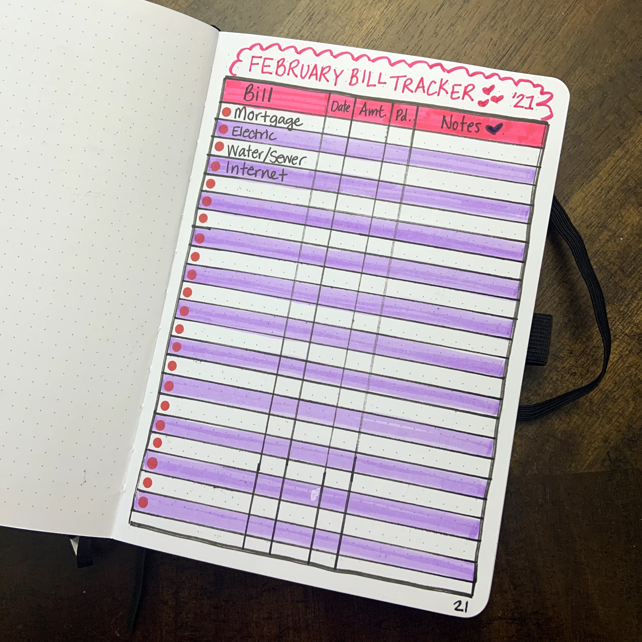
Then, I hand-draw a mood tracker and a bill tracker each month.  Here are pictures of each one!  I really love how the mason jar of hearts turned out for the mood tracker - so cute!  


I have more bills than this - but for privacy's sake I took the picture at this point before I wrote the rest! 

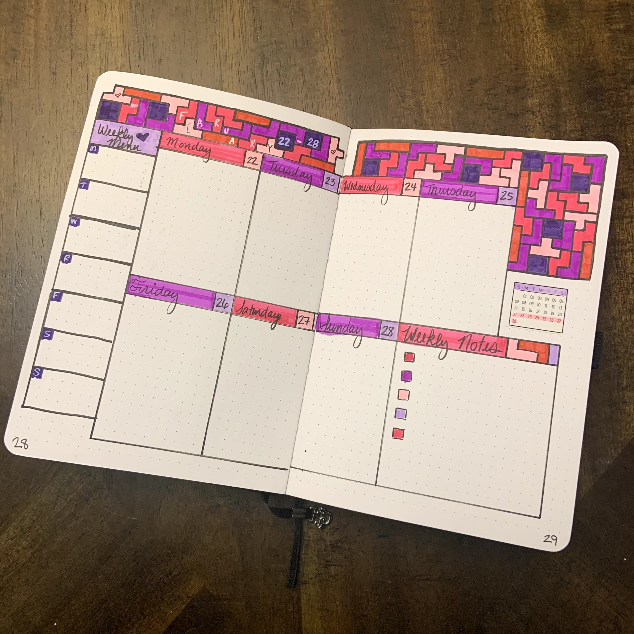
Finally, I'm including my weekly spreads for this month!  I'm not sure I will include these every month, but I really loved how these ones turned out.  I've settled on a weekly spread that I really like right now, it has a box for each day plus a larger one for notes, and a column on the left for our weekly dinner planning. This month, each week had a little theme: 

Wk 1 - Violets (February flower of the month) 


Wk 2 - Watercolor Hearts


Wk 3 - Stripes and Dots
Wk 4 - Tetris

....and that's it!  I hope you guys enjoyed seeing this layout!  Do any of you use a bullet journal? What was your theme of the month for February?  Let me know in the comments!!  

Saturday, January 2, 2021

2021 Bullet Journal Journey - January

Happy New Year!!!  I've been so excited to share with you my 2021 bullet journal!!!  I decided after last year to jump into bullet journaling with a blank journal this year after my year with the blank calendar format from 2020.  I did a LOT of research, and decided to go with a book from Archer and Olive.  It has thick pages that hold up to just about any type of brush marker or paint pen, which gives me a LOT of options to decorate the journal.  Here is the one I picked out:  

I've decided that for each month, I'm going to start with the following basic format: 

- Month intro and goals spread

- Monthly calendar spread

- Monthly mood tracker and budget spread

- Weekly spreads with a spot for notes and menu planning

For January, I went with a cool, blue/purple theme.  I also miscalculated my pages and so I ended up combining the calendar and monthly goals spread.  It turned out really nice, but the calendar is definitely smaller than I'd like and I'll fix that in upcoming months:  


I really enjoyed using my mildliners, clean color dot pens, and posca pens to create these pages!  I'm also looking forward to trying out several weekly spreads to see which type works best for me in this journal.  Last January, my mood tracker was a scarf on a snowman, and so I thought this cozy hat would make a cute mood tracker for this year!!!  I can't wait to see it once it's finished!  I also really missed out on adding a watercolor strip to this month.  I could still add one under the January calendar.... we shall see.  But overall I love the thick pages of this journal and how easy it is to format.  

Are any of you taking the bullet journal journey this year?  Let me know how you formal yours in the comments!  


Saturday, December 5, 2020

December Bullet Journal Layout

I know this is a few days late, but I'm finally getting around to posting my December layout for my bullet journal!  

Bullet journaling is a new hobby for me this year - though I have always had a planner that I detail and decorate!  I finally decided this year to take the plunge to a completely blank planner and to use it as a bullet journal. 

This is the planner I chose, and I love it for many reasons: 

1. The calendars were perfect for me

2. The pages are relatively thick - not quite thick enough for paint but really good

3. The layouts were pretty perfect for a beginner journal.  I wanted more pages month to month, instead of a big block of pages at the end, but for a starter journal this was great.  

In truth, next year I'm going with something else because I have more confidence now, but this was a wonderful starter for anyone that likes to bullet journal!  

Each month, my usual journal setup is to watercolor a strip for the calendar, and then follow up with a monthly goals and inspiration page and mood tracker.  This month's theme is pretty predictable, but I think it turned out super cute!


I made the watercolor strip with my Paul Rubens watercolors and Strathmore Black Mixed Media paper.  On the bigger layout, I use some go-to products each month.  One is my Kuretake Clean Color Dot pens - I'm OBSESSED with these pens!  They make beautiful dots and come in vibrant colors!  They are also great for coloring the mood tracker.  I also love my Zebra MildLiners - they are the perfect, affordable brush pens in beautiful, muted colors.  I also love my stickers from Scribble Sticker Co, Plannologie, and Happy Blue Tree - all businesses on Etsy.  All three shops offer amazing quality and affordable products!  

If you have any questions about my bullet journaling journey, please feel free to leave it in the comments!