Tuesday, March 30, 2021

Dyeing Easter Eggs - Tye Dye Style!

For the past several years, my daughter and I have used the cool whip and food coloring method to dye our easter eggs!  This year, instead of buying more gel food coloring, I wanted to try doing it with my non-toxic watercolor dyes!  It is important to note that we did this with non-toxic watercolor dyes, so we could eat the eggs!  

We started by hard boiling the eggs, and then I put them in an ice water bath to cool them down.  Then, we spread out cool whip on two pans.  

Next, I took 4 different colors of dye the work together and drop it randomly all over the cool whip.  I used ocean/sea colors and my daughter did unicorn/galaxy colors.  Then, with a craft stick, we stirred the cool whip up a bit so that there were pretty swirls all through the eggs.  


Finally, we took the eggs and rolled them in the cool whip, making sure that they were completely covered on all sides!  We then let the eggs sit for about 20-30 minutes.  


When we rinsed these ones off, the swirls were pretty but less vibrant than in past years.  Here are the ones we did a year ago to show what they should do:  

I don't think we added enough dye to get the vibrancy that we were looking for.  But, my daughter and I decided to use the watercolor and some straws and water pipettes to go right onto the eggs to create a more vibrant, tie dyed effect:  


They turned out really cool!!! We had a lot of fun doing these eggs!  I always try to do something that is a fun project so that we can enjoy the journey!  

Do any of you color eggs?  What fun ways have you tried before?  Leave you suggestions in the comments below!  

Saturday, March 27, 2021

March Card Roundup

 This month, we have several family birthdays!  I made 3 birthday cards this month that were a lot of fun, and very different!  Again, I am continuing my goal of not spending any money on new card supplies this year, so everything here was made with supplies that I have had since 2020 or earlier.  

I love the colors on this card!  The sentiment and the bottom strip were made last year using my Ken Oliver watercolor powders, pearlescent powder, and watercolor paper.  I die cut a bunch of stuff out of those papers when I made them and tucked it into a basket for future use.  I love grabbing those pieces and making cards based around them!  I matched it with this beautiful purple glitter paper from DCWV and a blue cardstock from Stampin Up.  I added black jewels and 33 in thickers to finish off the card.  


Isn't this die cut background so pretty?  And it gives you a bunch of really pretty smaller hearts to use as embellishments!  I colored in the biggest hearts with a Wink of Stella pen, and used a Lawn Fawn birthday sentiment to emboss the sentiment on a tag I had.  The smaller sentiment came from a set of sentiment strips I bought from Simon Says Stamp last year.  Slimline cards are a fun, different shape that mails very well and adds interest to the card.  

Finally, this card is a clean and simple design that's perfect for anyone!  This stamp from Waffle Flower is big and bold and one of my favorites.  This is an old patterned paper I found in my stash, and I added washi tape and buttons as clean embellishments.  The kraft on black looks so nice in my opinion.  

These are three different birthday designs that you could easily do with your own stamps or supplies!  The first one could be done with inks or watercolors of any kind, and could be made with any type of die cut sentiment.  The second card showcases a fun die cut, but could also be done with patterned paper as well if that's what you have!  The third one highlights a big and bold sentiment stamp with clean, simple details.  I hope that these cards give you some inspiration to pick up your own papercrafting supplies and send something! 

Tuesday, March 23, 2021

Metallic Pen Roundup and Review

Hello hello!  Over the winter, I randomly acquired several different brands of metallic pens.  I started with some metallic pens in the 2020 Holiday Sketchbox, and in a set of acrylic paint pens I bought for my daughter.  Then, I picked up a cheap set on Ali Express and Zulily.  Finally, in preparation for this blog I purchased two more budget brands, one on Amazon and one at Dollar Tree.  This ALL started because I noticed that my expensive set of metallic pens seemed to look a lot less shiny than my other, cheaper sets.  Therefore, I set out to see which ones were worth the money! 

I did a full test on black paper, which is the main place I would use metallic pens.  

I did NOT consider the following things: 

  • Ability to work on non-paper mediums
  • Longevity of use - I didn't consider this because most of the time, metallic pens don't last a long time.  I'm lucky if I can get 1-2 years of use out of them, regardless of their price.  Because of this, I didn't buy copies to try to run them dry.  
  • Nib size - A lot of these pens had nibs that were similar in size but not exactly the same.  I did not feel it necessary to buy new ones in matching nib sizes, and also did not count that for or against any of the pens.  I *did* note if you could only get the pen in one nib size because that does seem important!  
Here are the things that I DID judge each one on:  
  • Price, both total price and per pen price.  I also considered if you could buy the metallics separately from larger sets of markers as that can also not be cost effective. 
  • Pigmentation
  • Shininess once dried
  • For the gold specifically, the ability to look gold and not "silver gold."  Some metallic pens have a lot more silver in them than their actual pigment color. 
  • Accessibility for me.  This won't be the same for everyone, but should be pretty similar for most in the United States at least.  
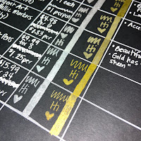
Ok so without further ado, here's my swatch AND my thoughts on each pen set.  The list is in the swatch order, I will discuss favorites/least favorites at the end of the blog.  


1. Faber Castell Pitt Artist Pen
Pros: 
  • Accessible.  Amazon and Blick have them.  
  • They come in packs of 3 or 4, so you don't have to buy a bunch of things you don't need to get the metallic pens. 
  • Nibs are high quality
Cons: 
  • Expensive.  These were at the high end of our prices, which would be ok except... 
  • Poor pigment payout.  This set was by FAR the worst pigment payout of all the pens tested.  It was really disappointing! 
2. Baoke Metallic Craftwork Pens
Pros:
  • Accessible!  I got these on Ali Express, which takes awhile to get, but I also found them for a little more money on Amazon.  The Amazon listing, depending on how many you bought cost anywhere between $1.74 per pen (4 pack) to the same $0.83 per pen (12 pack).  
  • Pigment!!!!  Holy moley these pigments were beautiful!  I didn't think I would get pigments this good from a non-paint pen.  
  • They come in packs of gold and silver only, so you don't have to buy other colors to get the metallics. 
Cons: 
  • These only seem to have one size of nib, and while I'm not holding the nib quality against it, you would not be able to get fine details easily with these pens.  
3.  Crafter's Square Metallic Marker
Pros: 
  • Affordable!  Price is $1 per marker and you buy them separately.  
  • Markers are smooth and pigmented.  
Cons: 
  • I know on the swatch I said these are accessible, but that's because I have a Dollar Tree right near my house!  These are only available at the Dollar Tree, and so if you don't have a Dollar Tree locally, they might be hard to find.  
  • This is one of two gold pens that has that "silver gold" sheen that I was talking about.  But the pigment payout is STILL better than the Faber Castell Pens in my opinion. 
4.  Sargent Art Metallic Markers
Pros: 
  • Accessible.  I bought these from Zulily with other art supplies, but Amazon also sells them for the same price.  
  • Affordable!  
  • The nibs on these markers are really nice and flexible and felt very high quality.  These were my favorite nibs!  
  • Pigment payout on these markers was good and they were shiny!  
Cons: 
  • The markers come in a pack of 6, which has other colors.  This is a con for me, because I will definitely use the gold and silver faster than the other colors and won't be able to easily replace the gold and silver.  
  • This was the other set of pens with the "silver gold" sheen on the pens, and it was probably the worst of the two.  
5.  Miaosun Acrylic Paint Pens
Pros: 
  • Accessible. I got these on Amazon.  
  • Reasonably affordable.  These were actually on the higher end of our price point at $1.25 a pen.  
  • Excellent pigment payout.  Being a paint pen, this one was immediately superior to everything that came before it.  
  • Pack of 8 had 3 gold, 3 silver, 1 black and 1 white in it.  This is good for replacing the pens.  
Cons: 
  • These *were* on the upper end of the price point at $1.25 a pen, but I'm really just stretching there to find a con.  
6. AROIC Acrylic Paint Pens
Pros: 
  • Super affordable!  This was the most affordable pen I tried!  
  • Accessible!  This one was an Amazon buy.  
  • Excellent pigment payout, very similar to the other paint pen above.  
Cons: 
  • These two metallic pens came in a set of 24, and I couldn't see a way to just buy the gold and silver on their own.  I've already used both the gold and silver quite a bit from this set, and so I wish they would sell the metallics separately.  
  • The gold had some glitter in it, which helped with the shine but was definitely a surprise. 
Specialty Pen: Molotow Liquid Chrome Pen

Pros: 
  • Best silver color that I own.  Pigment payout is incredible, and shine is beautiful!  
  • Accessible!  These can be purchased on Amazon or Blick.  
  • Comes in several different nib sizes.
Cons: 
  • Each pen runs about $10-12 depending on nib size etc.  These are SUPER pricey pens!  I got one in an art box after I bought one myself, otherwise I wouldn't have two of them!  

Ok, so who wins the battle?  

Top 3 picks (one for large coverage, one for details, one special consideration): 
  • Baoke Metallic Craftwork Pen
    • This pen was affordable and had excellent pigment payout!  It comes in metallics only sets, and has a nice sized nib for coverage!  
  • Miaosun Acrylic Paint Pens
    • These pens are affordable and also had excellent pigment payout!  This comes in a metallics plus black and white paint pen set, which is very reasonable for the price.  These pens also had the best pigment payout AND have a nice, fine nib to get into the details!  
  • Molotow Liquid Chrome Pen - Special Consideration
    • This pen is amazing but it was EXPENSIVE.  I've only had both of mine for about 5-6 months, but so far they both still work great.  This is definitely not a budget brand, and doesn't have a gold counterpart that I have discovered to date.  But this one does work really well!  
Bottom 2 picks: 
  • Sargent Art Metallic Markers
    • These weren't expensive, but they were the same price as other budget pens that performed better.  They also only come in a set of 6 colors as far as I could find, and so you cannot buy the gold and silver separately.  
  • Faber-Castell Pitt Artist Pens
    • Easily, these were my biggest disappointment! I got these in an art box, BUT they are expensive pens and they had a really disappointing pigment payout!  I would definitely pay for any of the other brands before I'd buy these again.  
I know I didn't test every type of metallic pen or marker out there, but I figured I had a pretty large cross section here to consider!  Which brands would you like to see me test in the future?  Sharpie? Posca?  Let me know in the comments below!  

Tuesday, March 16, 2021

March Paletteful Packs - REDEMPTION! All things POSCA!!!

Ok guys, so I know LAST month I was not too kind about Paletteful Packs... so this month I was really hoping they would deliver in a big way....  

AND. THEY. DID!!!!


I know that's a spoiler - but yes it was SO good!  Here's what was in the box, swatches, and what I thought of everything!  

POSCA Pens - Aqua, Green, Pink and Yellow  

I mean, what could I possibly say about these pens that hasn't already been said?!?!?!  They are just fabulous!  I love their coverage and how easy they are to use.  They are the top tier of paint pens.  I already had all 4 of these colors, so I was happy to set these 4 aside completely wrapped until the ones I have are used up.  This color selection was a great and versatile palette.  But these are such a fun and useful art supply!  

POSCA Pastel Pencils - Red and Green

These were an interesting add to the box.  I have never worked with these pastel pencils before, but they seemed to be wax based and did not blend with water or alcohol.  I do not have gamsol, so I didn't try to break them down in that fashion.  These were a nice texture and added a nice variety to the box!  I would have preferred to get a color other than green as I already had plenty of green in this box, but they were fun to play with and layered well to create texture on my final piece.  

Copic Opaque White Pigment 

This was the MOST exciting thing in the box for me!  I have almost purchased this ink several times for myself, but it's expensive and I already have several opaque white mediums.  I'm SO glad I didn't own it because it was the best surprise in this box!  It's beautifully opaque, and very, very fluid!  It worked well both under and over the posca pens, and under the pastels.  This is a fabulous, high end art supply that I will use over and over again!  Thank you PP for this amazing item!  

Robert Simmons Sapphire Brush - Round #3

This brush is a nice #3 round brush.  It works well and will be a nice addition to my brush collection.  I will say that with an MSRP of $13, I feel like a more affordable brush could have been included in order to add another POSCA product, either pen or pastel.  BUT that's really just splitting hairs over things, literally.  

Crescent Ultra-Black Textured Board 8"x10" - 3 Pack

These are very nice illustration boards!  I liked working on it and felt that it held up really well under the POSCA pens specifically.  I'm not usually one for working on thick boards, so this was a fun and different challenge!  I ended up cutting my boards in half so that my daughter and I could work with smaller picture sizes.  I also tested the supplies on black mixed media paper, and it also held up quite nicely with everything in the box.  

So what did I make?  Well, Paletteful Packs does prompts for their boxes, and I started with Prompt #2: Cactus/Succulent.  Yes, I know, but succulents are my ABSOLUTE favorite thing to draw or paint!  So Here are my perfectly Paletteful POSCA succulents: 

I really liked using the pastel overtop of the marker to create texture and interest.  I also liked using markers and pastels at the bottom to create an almost sandy looking ground.  I also used the copic white to make a starry sky, and I *did* cheat a little and used one of the micron pens from last month's box to add prickles to my succulents.  

Was this box worth it?  Well, Paletteful Packs values this box at $58.15.  I went through and was able to value this box for $51.73, so about $6.50 less than what they valued the box at.  I used prices from Blick and Amazon.  This price included valuing the pastels by dividing a 24 pack up, so I do not believe I would be able to test the pastels by themselves easily without a box like this.  All things considered, I would ABSOLUTELY say that this box was worth the $40 that I paid for it!  I will use everything in the box, especially the pens and the Copic ink.  I am glad that I had a chance to test the pastels, I would probably not purchase a whole set of them BUT I'm glad to have tried them.  I also enjoyed getting to paint on the illustration boards, that is not something that I have done before and so it was really fun! So THANK YOU Paletteful Packs, I'm really glad I stuck around for another month, and I'm excited to see what we get in April!  

What do you think of this box?  Do you love POSCA pens as much as me?  Let me know in the comments below!!!  

Saturday, March 13, 2021

Product Review - Greenleaf and Blueberry Paints

This year for Christmas, my husband bought me some lovely handmade watercolor paints!  I was so excited by this, because I really wanted to try handmade paints but they are a bit pricey.  It was a wonderful gift idea and I was so excited!  He purchased me 4 starter half-pans from Greenleaf and Blueberry, a small US company specializing in art supplies for the traveling artist.  I was SO excited to get these paints!  

He started me out with a very earthy set of colors, and I was very glad for that because I love landscapes!  The four colors I'm reviewing are: 

  • Red Ochre
  • Green Earth
  • Pthalocyanine Green
  • Vivanite
Per the website, here's what the seller has to say about each of their paints: 
The Paint:
-Artist Grade
-Single Pigment
-Lightfast
-No Fillers, brighteners, or dispersants
-Pure, Genuine, Natural Pigments
-Made Traditionally By Hand With Muller & Slab
-Artist & Chemist Formulated

I have done several projects with these paints, both on their own and in conjunction with other watercolors to see how they would do in several arenas.  Here are some things I thought were notable: 
  • Red Ochre and Pthalo Green were beautifully pigmented.  I actually gasped when I swatched them I was so happy.  They also mix beautifully with other artist grade paints.  The Red Ochre is a bit more opaque than the Pthalo Green, which is exactly as it should be.  I was very impressed with these paints in the upfront tests.  
  • Green Earth is a beautiful color but it is a weaker shade.  It takes a lot of work to get a big pigment payout, and it is weaker in mixes than the first two.  I still really like this color, but I have come to use it as a stand-alone and not as a mixable color.  
  • Vivanite.  Holy cow guys.  This color is probably one of the coolest paints I've ever owned!  It's very pigmented but the GRANULATION is out of control amazing!  It is similar in color to Payne's Gray, but it adds so much richness and complexity to a piece because of the granulation!  It works beautifully as a background or in landscape painting.  I'm just in love with it!  
Here are some paintings I've done with these paints (some standalone, some mixed), and my thoughts on each:  


This was my first painting done with these paints.  I really enjoyed how beautifully they worked to make an easy landscape painting.  The Vivanite as a background is just so lovely here, and you can really see how beautifully contrasting the two green shades are.  


This was a fun sketchbook "rocks" activity I did, mainly to see pigmentation, granulation, etc.  I had to work much harder to get the Green Earth to stand up in this piece to the other colors, but it does stand up to them with a little extra work!  Once again, you see how BEAUTIFUL the granulation is on the Vivanite here.  The gray is really what makes this piece look like rocks instead of blobs in my opinion!  I love that paint!  


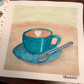
Here I used the paints to do a little teacup.  I don't love this piece but I do love how these paints laid down as full background washes!  The Vivanite mixed very well into the other paints here to create shadows on objects, which was really great too.  


This little painting was done with some G&B paints and other handmade watercolors mixed together.  I mixed the Vivanite with Ultramarine Blue in order to get the background gradient, and I mixed the Pthalo Green with the same Ultramarine Blue to get the water.  The sand is the Red Ochre, mixed with a smidge of Lemon Yellow.  These paints mixed beautifully and created a really lovely little beach scene here.  


Finally, I used all four paints, along with several other colors, to create this Spring wreath.  Here you can see that the paints do a nice job of layering and glazing, something I hadn't really done with them in the other paintings.  

These paints have been a fabulous foundation to my handmade watercolor collection.  Would I buy more of them?  Absolutely!  I am definitely going to look into more of their granulating colors, and I would love to have a few more of their earth tones to enrich my palette further.  If you are in the market for handmade watercolors, I would *highly* recommend Greenleaf and Blueberry!  

Have you tried handmade watercolors before?  What do you think of these paints?  Let me know in the comments below!  

Tuesday, March 9, 2021

Canvas Painting with my Daughter - Fireflies in Mason Jars

Before the pandemic began, I really wanted to go to a studio that does paint and sip parties!  They looked like such a good time, and even though I'm not really an acrylic painter, I'm always up for an art adventure!  

But alas, Covid happened and I never got there.  Recently, I did venture into our local Dollar Tree.  I don't go hardly anywhere right now, but our Dollar Tree is rarely busy and right around the corner from my house, so I stopped by to specifically check out the crafting section!  I found SO many great things!!!  I'm doing a post later on this month about all of my favorite bargain finds, so this is just a preview!  They had SO many canvases!!!  I decided to snag 2 small canvases for my daughter and I, each 5x7:  

Once I brought the canvases home, my daughter and I took to Pinterest to find an image we thought would be fun to paint.  I came across a fab image from Grade Onederful of a mason jar filled with fireflies!  It was originally a watercolor picture, but we both looked at it and decided we could do it on canvases pretty easily!  

Before we started, I *did* gesso each canvas after we brought them home.  I bought a HUGE bottle of gesso to use for all acrylic painting projects awhile ago, and so I always make sure to gesso my cheap canvases because it improves the quality a ton AND it helps your paint to go further!  

We used Artist's Loft acrylic paint.  I have a good amount of it because it's inexpensive and our local Michael's has been great about doing curbside pickup!  We both started by sketching out our mason jars and fireflies on the canvas.  Then we painted!  


We used metallic white for the stars in the jars, and a sponge to make the yellow glow for the fireflies!  Then we used acrylic paint pens to draw and color in the fireflies!  


This was such a fun project that my daughter and I decided we are going to buy and make canvases for at least every season to hang in a spot in our home! 

Have you ever tried budget canvases for fun projects?  What would you paint for springtime?  Let me know in the comments below!  

Saturday, March 6, 2021

March Sketchbox - Holy Markers Batman!!!!

I was so excited for this Sketchbox to get here, and my heart just about burst when I opened it!  

Late last year, we got a box that had a combination of water-based and alcohol-based markers and I had commented at that time on how much better it would have been if it was all alcohol markers.  

WELL IT'S HERE!  

This box is full of alcohol markers and MAN was I excited!  But of course, not all alcohol markers are created equal, and so I tabled my excitement and got to swatching!  Here's my swatches and my thoughts on each product.  

Contents, Prices, and Swatches: 

1. Marabu Marker Set (Sketchbox Exclusive) - $17.50

This set came with a blender, pink, purple, and red alcohol markers with chisel and bullet nibs.  I honestly loved these markers.  They are pigmented, blendable, and a fabulous standard alcohol marker! They performed fabulous on their own and with the other markers as well,  These colors were a fabulous foundation for the rest of what was to come.  It also came with two "permanent" markers in brown and green with bullet and fineliner nibs. These permanent markers are alcohol-based and worked beautifully as fineliners and as regular alcohol markers as well.  Other than the barrel/nibs, I saw no difference between these and the other alcohol markers.  

2.  Copic Sketch, V12 Pale Lilac - $7.99

What can I say, it's a Copic Sketch.  It's the king of all alcohol markers.  It worked like a dream, and the other markers worked wonderfully with it!   Copic Sketch has a brush and chisel nib, which is my preferred nib combo for an alcohol marker BUT I'm not too picky - I've worked with all types!  

3. Copic Classic, V15 Mallow - $7.99

This was a lovely medium purple which allowed for a LOVELY purple gradient!  Purples are generally VERY hard to blend with alcohol markers, but these three purples (Copic Classic, Copic Sketch, and the Marabu Purple) actually achieved a great blend on the paper!  This marker has a bullet and chisel nib and will get lots of use in my collection because of it's color! 

4. AD Spectra Marker, 047 Walnut and 012 Wine - $6.55 each

These were also a fabulous addition to the box!! The wine color was a beautiful dark red that worked wonderfully with the Marabu red marker!  The walnut made a nice blend with the brown Marabu marker too!  These markers have a brush and pointed chisel nib.  I LOVE the pointed chisel nib, it gets fine details AND can cover large areas - it's a really unique tip!  I have had Spectra markers before and I am always impressed by their quality. 

5.  AD Marker Paper, 4x6in Pad, 24 Sheets - $8.49

So at first glance I LOVED this paper.  The swatches worked so well on there, the blender marker did it's job with everything and the gradients were lovely.  It also bled through but not to the next page, so it can clearly take a lot of marker before ruining further pages would be a problem.  When I started blending on the paper, the paper was not my favorite type of marker paper.  I worked with it for awhile, and the pigment sat on top of the paper and blended so easily that it mixed up on the tips of my markers and blender.  I have used marker paper like this before, and it is not my preference BUT I know loads of people that love it.  I think I need to learn how to use it, and so after doing two practice pieces on it I decided not to use it for my large art piece for this box.  HOWEVER, I do think this paper is worth the money if you like this type of paper!  

My first practice piece was of some floral doodles that I used to check out the gradients.  I do like how this piece turned out, but the lightest colors got totally erased by the way I tried to blend on the paper.  I still like where I ended up with this one, but I knew for my second idea I wanted to get smooth blends, so I used my marker sketchbook.  

It's no secret at this point that I love the Legend of Zelda.  When I saw these colors, I KNEW I wanted to draw Vaati.  Vaati is the villian of the Minish Cap.  If you are a Zelda fan and you haven't played the Minish Cap, I *HIGHLY* recommend it!  It's such a great game, and is $8 on the Wii or WiiU shop if you own one of those consoles.  Vaati does have some gold on him, but I just swapped out the brown for the gold.  I also used the lightest purple and the blender to make the skin as "purple gray" as possible, and I think it worked out quite well!  Full disclosure, I did use a black fineliner and a while gel pen to do line work and add details to this piece, but he was so beautiful that I couldn't resist adding those details!  Overall, this is my second Vaati piece in the last year, and I love drawing him.  I love his cape too!  


In addition, my lovely 7 year old daughter always does the Sketchbox with me!  She LOVES them and is often even better with random supplies than me. I love her creative spirit so much!  When she swatched this box, she immediately knew what she wanted to draw - the Truffula Trees from the Lorax!  I love how her picture turned out: 
 

So overall, was this box worth it?  ABSOLUTELY!  The color palette was absolutely beautiful, and worked together SO well to make artwork.  The alcohol markers are all good quality and will be added to my collection proudly! The nibs on the Spectra markers make me want to look out for them on sales to see if I can grab some more because they were so useful and unique!  And, even though I didn't love that marker paper I now KNOW how it works/behaves and so I can practice on it and decide if I'd like to buy more of i.!  This box was SO much fun to play with! 

Did you get this month's Sketchbox?  What did you think of it?  Are you a fan of alcohol markers?  What would you make with this box?  Let me know in the comments below!

Tuesday, March 2, 2021

Bullet Journal Journey - March 2021

It's the beginning of March, so that means we are going to do another bullet journal flip-through!  This month, I knew I wanted to go with something with a green/plant based theme.  I definitely wanted to include shamrocks and yellow/gold, without doing an all out St. Patrick's Day theme.  Since daffodils are the flower of March, I wanted to add some of them to the spread as well.

I did watercolor a strip for the calendar page, but I ended up liking it so much that I didn't want to cut it up. So, I used washi tapes instead this month!  The result is simple, but I like how it looks!  The mood tracker is a four-leaf clover, because it just felt like a fun one to do.  I can't wait to see how it turns out once it's colored in at the end of March!  The bill tracker is the same from month to month, only changing colors to match the theme.  


This month includes 5 weeks instead of 4, so you will get a little bit of April during this month.  Each week's theme was fun to do!  

Week 1: Leaves


Week 2: Daffodils 


Week 3: St. Patrick's Day

Week 4: Stripes

Week 5: Simple Shadows and another Daffodil 

I had a lot of fun coming up with this layout, and I really enjoy the creative energy I get from using a planner that I have built myself!  

Have you started your bullet journal journey?  How does it inspire your creativity?  What other things do you do to keep your creative juices flowing?  Let me know in the comments below!